Posted by
Ioana Negulescu
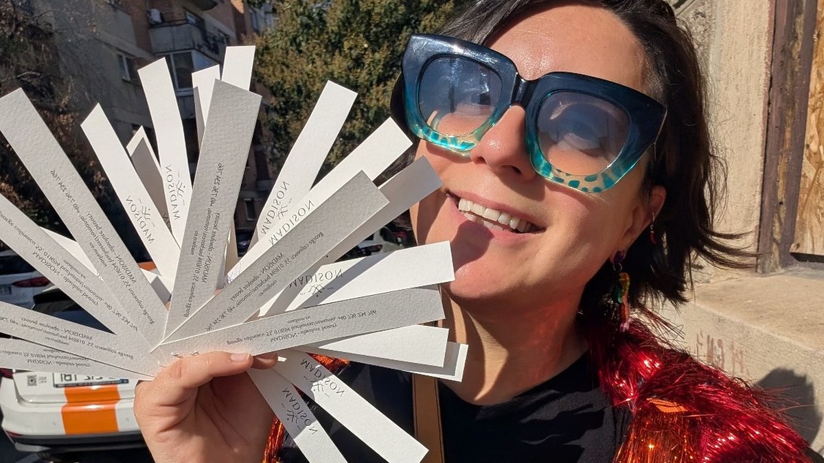
On my birthday I smelled more than 35 perfumes in one shop and walked out with a single bottle. I'll tell you which one, and why, at the end. Somewhere around the twentieth blotter it struck me that perfumers and website designers do the same job. Both make considered choices for a living. And a considered website, rather than just a website, is the one people remember.
I cook in my spare time and I train my nose the way I train my palate, so forgive the sensory detour. The argument underneath it is serious: the best lessons in user interface (UI) and user experience (UX) design often come from outside the field, and perfumery has a few that B2B marketers need right now.
This blog post is based on my webinar. You can watch it here and download the slides. But read on for the enhanced blog version too.
UI is what's in the bottle. UX is how it wears.
People use UI and UX as if they mean the same thing. They don't.
UI is the material thing. In a perfume it's the molecules, the alcohol or oil that carries them and the bottle. On your website it's the theme: how it looks, the buttons, the sections, the images.
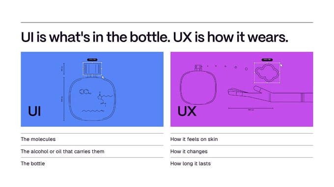
UX is how it feels and how it wears. In perfume, that's how the bottle sits in your hand, how long the scent lasts and how it makes you feel. On your website, it's how easy or hard it is for a visitor to do what they came to do. You need both. The second is where websites are won and lost.
AI is perfumery's synthetics moment
For most of history perfume came from nature: flowers, resins, wood and a few things from animals. Natural oils were expensive and supply was unreliable. One bad harvest changed your perfume.
Then chemistry arrived. In 1882 Houbigant launched Fougère Royale, usually credited as the first perfume built around a synthetic molecule, coumarin. In 1921 Chanel No. 5 made aldehydes famous. Synthetics were cheaper, more stable and always available.
Not everyone trusted the new ingredient. To many people, synthetic meant artificial, cheap, second rate, perhaps even bad for you. Some perfumers still insist on all-natural today. Yet synthetics are now in everything from supermarket scents to the most rarefied niche houses.
This sounds oddly familiar. Most of us use AI in our marketing, and a lot of us use it quietly and leave it off the label. The suspicion is the same; only the ingredient has changed.
Synthetics didn't replace nature. They widened the palette. That is exactly where websites are with AI.
Same laws, more room to play
Is UI/UX changing because of AI? Not the laws. The research behind good interface design has held since the 1980s and the data is still reliable. What has changed is the room to play within those laws. We can prototype and test faster. We can read behaviour data sooner and analyse it more deeply. We can personalise for each visitor more easily than before.
With so much generic AI-made content around us, the laws matter more, not less. Three to keep in your head:
- Fast. Conversions track speed. Portent's 2022 analysis found that a B2B site loading in one second converts at about three times the rate of one that takes five. (Our website optimisation guide covers the fixes.)
- Clear. Usability decides whether a visitor finishes a task. When the first click is on the right path, people succeed 87 percent of the time; when it isn't, 46 percent (Bailey, Wolfson, Nall and Koyani, 2009). A visible button with an obvious hover state and copy that says what happens next is the difference.
- Considered. The biggest reason people reject a website is design. In a Northumbria University study, 94 percent of the reasons participants gave for mistrusting a site were about design, not content (Sillence et al, 2004).
Fast, clear, considered. We'll come back to them.
Everything is forgettable until it's not
Every perfume fades from the second you spray it. Memory works the same way: a steep drop, then a long slow tail. Most website visits go exactly like that, in a working day full of other short tasks. Open your browser history at the end of a day and count the sites you switched between. It's a little insane.

So what makes something stick?
Perfumers build in three layers, a framework William Poucher published in 1955 to measure how fast each ingredient evaporates. Top notes are the loudest at first and the first to go: bright, light, citrus, gone in minutes. Heart notes carry the character of the perfume and last longer. Base notes start quieter and last longest: woods and musks.
Your website has notes too.
Top notes are speed and platform. The first thing anyone experiences and the first thing they forget. If the site doesn't work, nothing else in this post applies.
Heart notes are the journey. The navigation, and where someone goes after they land. Get the first click right and people reach what they need faster and with less frustration.
Base notes are the extras that make a site memorable. Personalisation, microinteractions, animation. A button that confirms it worked. A field that checks itself as you type. Nobody expects these. Done with restraint, they create delight. And delight is what people remember.

But without speed, and without a clear journey, nobody stays long enough to notice the base notes.
Crowd it by accident and nothing sticks
When did you last ask an AI a question and get an answer three times longer than you wanted? It happens to me far too often. I now keep a prompt that says: rewrite that in bullet points so I can scan it.
People have very little time and very little patience, and the research has said so from the start. People don't read, they scan. On an average page they read about 20 percent of the words (Nielsen Norman Group, 2008). They judge that a cluttered page looks worse in as little as 17 milliseconds, faster than a blink (Tuch et al, 2012). And yet home pages keep getting heavier: the median desktop page weighs more than twice what it did ten years ago (HTTP Archive Web Almanac, 2024).
Coding got easier, so everyone became a maximalist. Most of the time the home page is designed for the CEO rather than the customer. It ends up longer and wordier than any potential customer will put up with.
The moment someone lands on your website, they are your guest. Every unnecessary section and every unconsidered animation spends their time. So every element on your website needs to earn its place, and every animation needs a job. Respecting your visitors' time is how you get remembered.
Who is it for?
Two perfumes side by side on Fragrantica. On the left, Jo Malone's Wood Sage & Sea Salt: sage, sea salt, ambrette seed. Few ingredients, clean, made for almost everyone. On the right, Zoologist's Raccoon: Hawaiian pizza, banana peel, bubblegum, vegetable scraps. The brief, by its makers' own account, was a perfume that smells like a raccoon raiding your bins. I haven't smelled it. I badly want to.
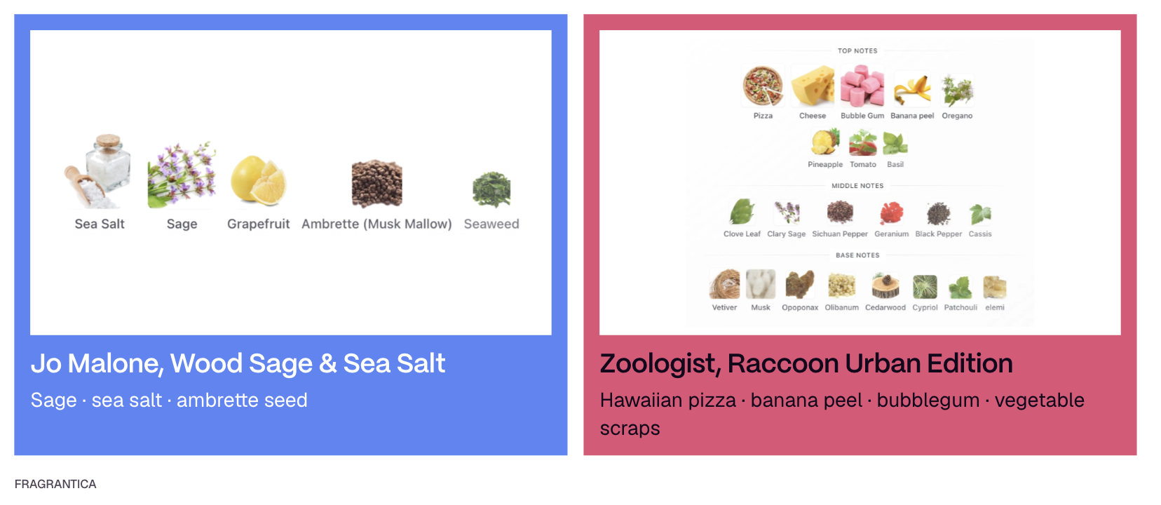
Both are deliberate. One is simple and clear; the other is maximalist and a little crazy. The question is who it is for. In B2B, the raccoon is almost never right. Your website is not a portfolio or a personality showcase. It has to convert, and that needs clarity.
Five decisions to make today
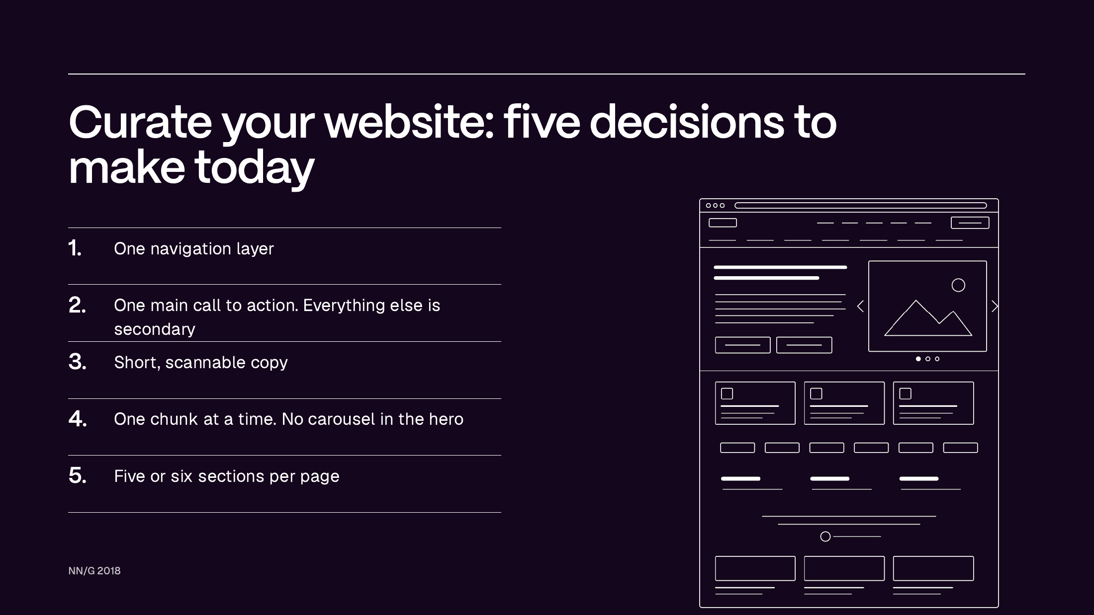
- One navigation layer. A menu inside a menu inside a menu is a wall of perfumes you can't choose from. Cognitive overload, and usability falls.
- One main call to action. Decide the one thing you most want people to do: book a demo, book a meeting, get in touch. Everything else stays, but quieter: a second, less prominent button or a plain text link.
- Short, scannable copy. Scroll your own page fast. Did anything stick? If not, shorten it.
- One chunk at a time. Each section carries one piece of information. Summary here; detail on another page, in documentation or in a sales conversation. And no carousel in the hero banner. They don't work. I spent a whole webinar on hero banners if you want the long version.
- Five or six sections per page. I see pages with 20 sections that take a minute to scroll. Check the heat map and the session recordings and you will find most people never reach the bottom. That is design, build and copy effort that never reaches a customer.
Matthew's ultimate B2B homepage webinar and our post on the questions your website should answer pick up where this list stops.
Design for the real shelf, not the showroom
I used to own a perfume with a lid I loved: a rubber flower, beautiful and far too big for the tiny bottle underneath. It never fitted on my shelf and it was always about to be knocked over. In the end I took the lid off and kept the perfume without it. The most beautiful part of the design was the part I removed.
Websites do this constantly. The hero video that looks stunning in the Figma file and crops horribly on a laptop. The page that is slightly broken on mobile. The link that goes nowhere. Judge every addition by how it behaves in real use, not in the showroom.
The bottle makes a promise before you smell anything
At the other end of the spectrum is Floraïku, a Paris house with a Japanese streak. Every bottle carries a haiku on the back: three lines, like the three layers of notes. The tall, illustrated lid looks like decoration. It isn't. Every bottle comes with a travel-size spray, and the lid is its holder.
That is premium with purpose. Someone noticed that people don't travel with their perfume because the bottles are too big, and designed for it. It goes beyond restraint and beyond considered design. It is a surprise.
What on your website anticipates a need the visitor hasn't voiced and turns it into a moment of delight?
Sillage is what stays above the threshold
Perfumers talk about sillage: the trail a scent leaves behind you as you walk away. Your website's sillage is what a visitor says about you to a colleague or their boss after they close the tab.
You can't stop the fade. Eventually they will forget, however good you are. But you can choose what stays. The website of the future works first. Then it is built for feeling: little moments of surprise, and the sense that someone designed it for you rather than for themselves.
You are the host
Back to the shop. You can buy perfume from a wall of beautiful bottles you have never smelled, or from someone who asks what you are looking for and curates the rest. When I walked in, nobody pointed me at a wall. Someone asked a question. Against a wall of bottles, choice paralysis wins.
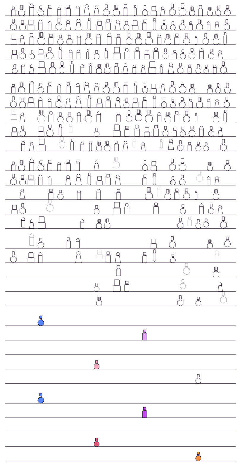
You are the host of your website. The best sites curate every visitor's experience the way that shop curated mine, which is the same lesson the greatest chefs teach us about websites.
You can't smell your own perfume. Or see your own website.
After a while you stop smelling the perfume you are wearing. The same happens to your website. You have looked at it every day for years, so you no longer see the slow page, the confusing menu or the button nobody clicks. (Perfume shops offer coffee beans to reset your nose. They work no better than fresh air.)
A fresh nose helps. Matthew Stibbe, our founder and CEO, runs a free 30-minute marketing strategy session: no pitch, just an exchange of thoughts about your website and what it could be.
Guava and smoke
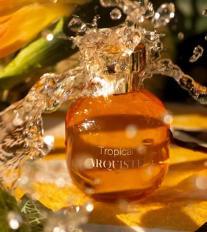 The perfume I bought was Arquiste's Tropical: guava and smoke. It came up after 35 others. It wasn't the boldest, the cleverest or the craziest, but it had the best story. The perfumer spent a New Year's Eve in Mérida, Mexico, somewhere with an old guava tree, and brought the midnight fireworks into the smoke. I had spent a New Year's Eve in Mérida in a place very like it. Two years after the perfume was made, I bought it for the story.
Storytelling matters as much for a website as it does for a perfume. If you want help finding yours, start with lateral thinking.
If your website were a perfume, what would it smell like, and what story would it tell?