Posted by
Ioana Negulescu
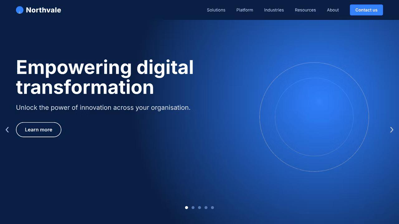
This week I showed a room full of marketers the homepage of a company called Northvale. Big blue banner, a headline that said "Empowering digital transformation", a button labelled "Learn more" and a carousel sliding through five more slogans. Then I asked what Northvale does.
Nobody knew. (Northvale is made up, but I have seen that banner a hundred times with a real logo on it.)
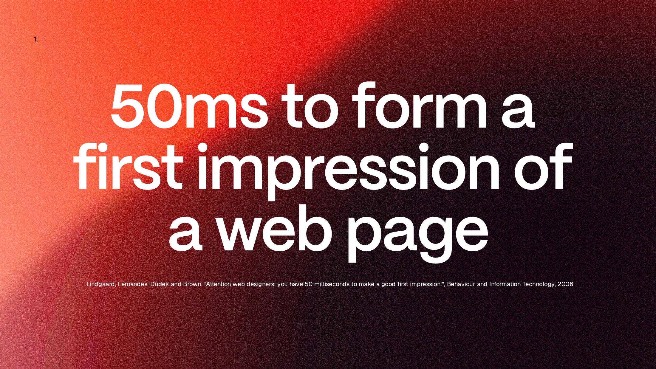
Your hero banner is the first thing a visitor tastes of your company. It gets 50 milliseconds to make an impression and a few seconds after that to survive it. Most B2B hero banners fail both tests because they try to serve the whole menu at once. The fix is restraint: one bite, cooked properly, that makes people hungry for more.
Read on for the full story or watch the original webinar here and download the slides here.
The amuse bouche problem
I live a semi-double life as a gourmet and a cook, and I keep finding that restaurants explain websites better than web design does.
In a good restaurant, a small bite arrives before anything you ordered. You didn't choose it. It is the chef's choice and usually one mouthful. In a great kitchen it is one of the most considered things on the menu, because it is the first thing you taste. In an average kitchen it turns up because it is expected. It says nothing about the chef.
That is the difference between a hero banner that was designed and one that was filled in.
You have 50 milliseconds, then a few seconds
Researchers at Carleton University found that people form a judgement of a web page in about 50 milliseconds. That is faster than a blink (Lindgaard, Fernandes, Dudek and Brown, Behaviour and Information Technology, 2006). That verdict is about the design: the layout, the balance, how it all hangs together. Nobody has read a word yet.
Then they start scanning the copy and decide whether the first impression survives.
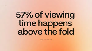
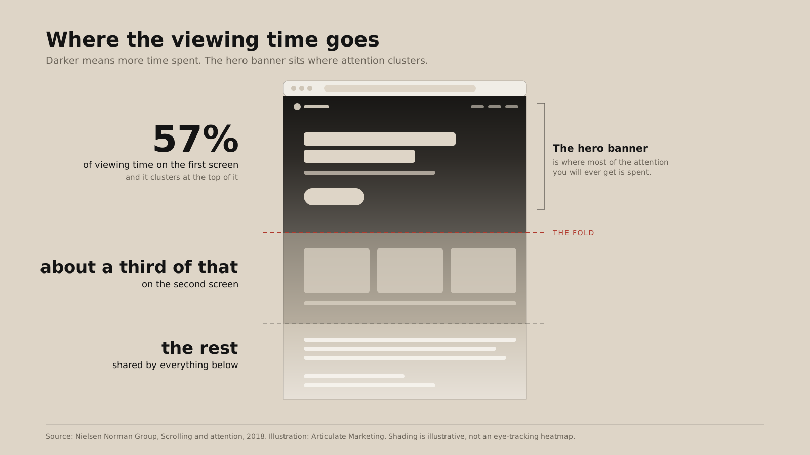
People do scroll. But the Nielsen Norman Group found in 2018 that 57 percent of viewing time still happens on the first screen. The next screen gets about a third of that. Everything below shares the rest. Even within the first screen, attention clusters at the top.
So the hero banner isn't decoration above the real content. It is where most of the attention you will ever get is spent. That is why I would stop obsessing about "above the fold" as a layout rule and start obsessing about the first impression, which happens to live there.
Carousels don't work
Let me get the big one out of the way. The Nielsen Norman Group found that auto-forwarding carousels annoy people and that nobody sees the slides after the first one. My brain didn't process any of Northvale's copy because it kept moving. Matthew has said the same thing more bluntly in The ultimate B2B homepage: carousels are never the answer.
If you have five messages you want in the hero, you have four too many.
Make the logo smaller
 Over my time working with more than a hundred clients on their websites, three requests come up again and again: make the logo bigger, add a super nav, make the navigation font bigger. Sometimes all three, plus a rotating strip for events.
Every one of them takes space from the first impression. Look at Apple's homepage: a tiny nav, one product name, two lines of copy, two buttons and a great deal of white space. The hero has room to breathe, and that is what makes it land.
Video banners get the same question. Yes, they can work, on two conditions.
First, you need a developer who can stop the video slowing down the whole page. If the hero isn't on screen the moment someone lands, those 50 milliseconds are already wasted. (Our guide to website optimisation covers speed.) Second, text on top of a moving image often loses readability and accessibility. Test it with real people before you sign it off.
Three or four ingredients, one of them the star
The best dishes use restraint. A rule of thumb in gastronomy is three or four star ingredients, one more important than the others, cooked well and plated to be remembered.
I understand the urge to say everything in the hero. It is your chance to talk about yourself and you are excited about what you do. But that urge comes from a fear that the visitor won't look at the rest of the site. Act on the fear and you make it come true: they can't scan it, they don't understand it, they leave.
You're not cutting out information. You're sequencing it. A website is a tasting menu, and the job of website architecture and customer journeys is to feed people what you do bit by bit, as deep as they choose to go.
Find your bite
If your kitchen could send out one bite, what would it be?
Here is the question I ask clients: what is the one thing your best customers would be devastated to lose if you disappeared tomorrow? Not what you do. What they would miss. It is usually very specific, and it is usually your bite.
Then run the logo swap test. Put your biggest competitor's logo next to your headline. Does it still make sense? If it does, it isn't your bite. Do the same with the design: drop a competitor's logo into your nav and ask whether the banner still looks like it belongs to you. Northvale fails instantly. "Empowering digital transformation" could belong to anyone.
The first two words decide whether the rest gets read
Most people don't read a headline. They glance at the start of it. The Nielsen Norman Group's eye-tracking work found that people often take in only the first two words, about 11 characters, before deciding whether to read on.
So front-load. Put the thing your buyer cares about first, not your company name or a warm-up. "We help organisations to…" spends four words and says nothing. My rule is ten words maximum, never more than two lines and never a paragraph.
Three prompts get you there, and your headline is usually somewhere in the middle of them:
- Say it to your best client. How would you describe what you do to someone who already trusts you, over coffee?
- Say it to a sceptic. What would you say to someone who thinks you're just another vendor?
- Say it in six words. That forces you to drop every word that isn't working.
For more exercises like these, my colleagues ran a webinar on lateral thinking for memorable website copy, and there is a longer piece on writing website copy the way a user-experience designer would.
The image is a concept, not a decoration
A hero banner is a headline plus imagery, and the concept matters more than the picture. A software product might call for an illustration of its interface. A playful tone of voice suits illustration. Community and bringing people together suits a collage of photographs.
On photography, you may hate me for this: stock is not that bad if it is chosen with care. There is a lot of terrible stock, and there is some that is fine. If you can't run a shoot, well-chosen stock is better than nothing. Images give the page room to breathe and pull the eye to the headline.
One button. Say what happens next.
Every hero needs a button. One. If you must have two, make one the clear primary (full colour) and the other quieter (an outline). The label should say exactly what happens when someone clicks.
"Learn more" has become the new "click here", as the Nielsen Norman Group puts it. It tells nobody where they are going. We've written about how to write and test better B2B website calls to action if you want to go further.
Same ingredients, better plating
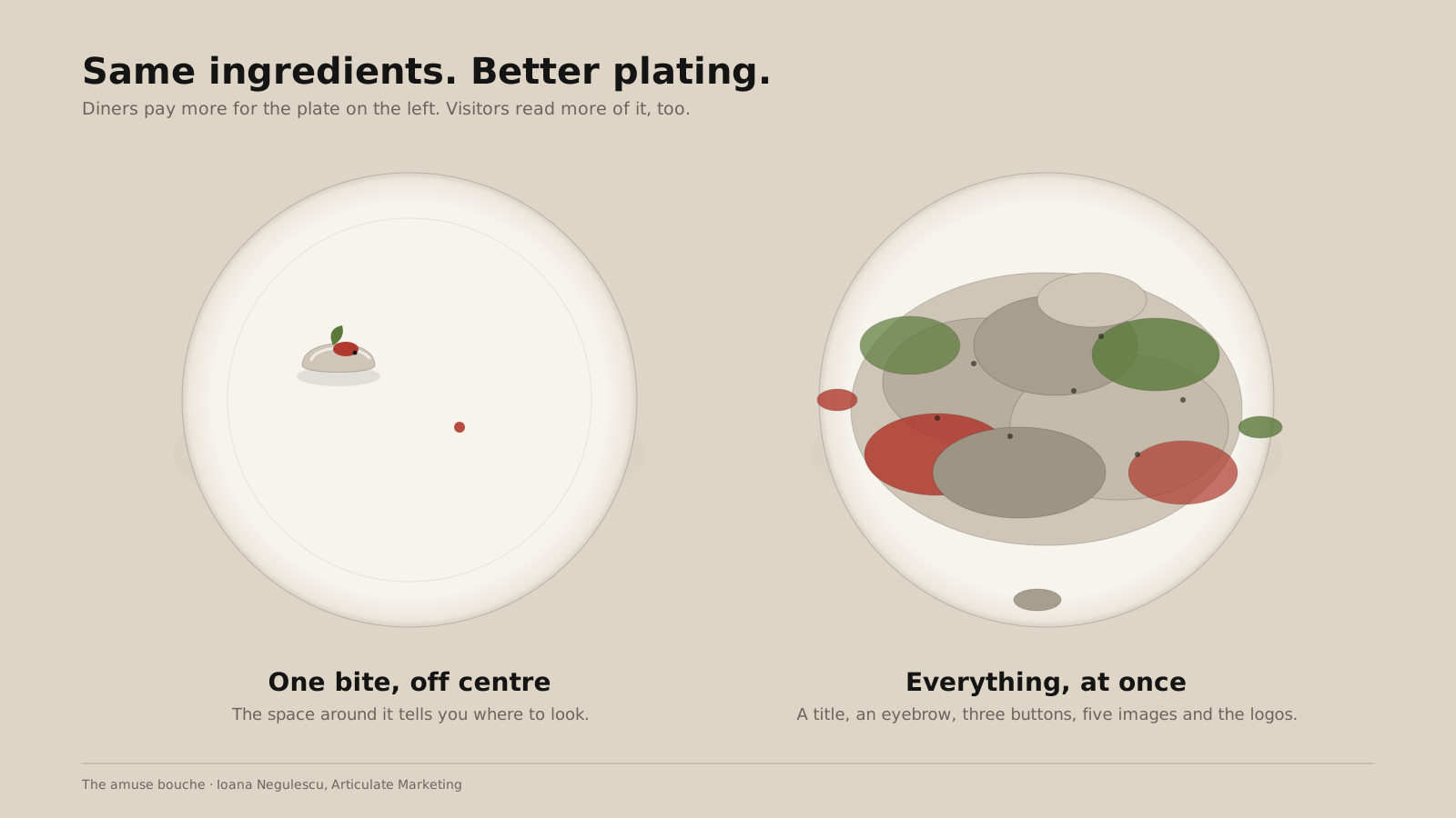
Take the same ingredients, plate them with more care and logic on a nicer plate, and diners will pay more. Websites work the same way, and your homepage is probably the most visited page you have. So ask your designer to spend a disproportionate amount of their attention on the hero.
But plating isn't piling. A title, an eyebrow, three buttons, five images, client logos and a row of accreditations isn't a hero banner. It is a salad someone tipped out of the bag.
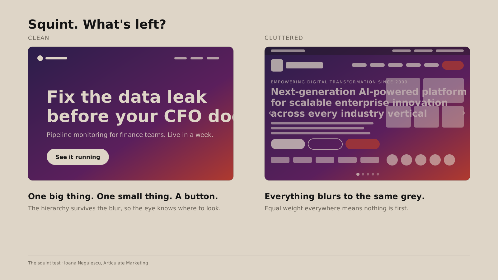
Here is the quickest test I know. Open your homepage and squint until the words blur. Designers use this for logos and layouts because what you see when you squint is the hierarchy. In a good hero you still see one big thing, one smaller thing and a button or two, and they are not the same size. The space around them is what makes the order visible. Think of a large plate with a small bite set slightly off centre, telling you where to look.
Grade your hero banner
Five questions. Be honest.
- Does it pass the logo swap test?
- Do the first two words carry the point?
- Does the image show something real?
- Is there one button that says what happens?
- Squint. Can you see one thing first?
If you scored well, your banner is already an amuse bouche. If you didn't, you know which ingredient to take off the plate first. For the rest of the page, Matthew's five questions your website should answer and our 12 top tips for B2B tech homepages pick up where the hero leaves off.
The full session, with the examples, is on demand: The amuse bouche: how to craft a hero banner that makes people hungry for more.
If you want a second opinion on your bite, our CEO Matthew Stibbe runs a free 30-minute marketing strategy session. It is outside thinking, not a sales pitch.
So, what will your amuse bouche look like?