 Posted by
Maddy Leslie
Posted by
Maddy Leslie
How long do you think it takes visitors to decide whether they want to stay on your B2B site? 10 seconds? It's more like 50 milliseconds… you need to make a good impression, fast, putting continuous effort into website optimisation. What we’re saying here is - folks, tidy your room.
If your bounce rate is high, too many of your website visitors are landing on your website, taking a look and going elsewhere. What does that say? Nothing good.
People who browse the web aren't snobbish, but the fact is they have a lot of alternatives to look at. That's why you have to make a good first impression on website visitors: to guarantee they stick around long enough for you to show them how great you are.
This is our ultimate guide to optimising your website. Read it right here on this page, or download it as a PDF by filling in the form below.
Table of contents
Chapter 1: Want a good website? Conduct an honest site evaluation
Chapter 2: A word on tools and platforms: how they impact your B2B website
Chapter 3: How to optimise your website traffic plan to create intuitive user journeys
Chapter 4: Why your website is rubbish at getting leads (or how to increase your conversion rate)
Chapter 5: The 3 ways brand and design make or break first impressions
Chapter 6: Showhome vs real home: how to keep your B2B site presentable
Chapter 7: What to prioritise before a new website launch and what to do later
Chapter 1: Want a good website? Conduct an honest site evaluation
A good website manages to meet the expectations of visitors within those crucial first milliseconds. And expectations are high. A website must load quickly, for example, and if it’s poorly designed, it won’t be long until visitors click away and look elsewhere, in turn boosting exit and bounce rate metrics.
But optimised websites don’t just happen overnight, however. No sir. It requires consistent website optimisation and iterative improvements, conducted over time.
Here are some of the things you need to consider if you want a polished website.
First up: The tools you need to conduct a website evaluation
When it comes to an ‘honest’ evaluation, we believe that the toolkit we use is worth its salt. At the very least, it’s been tried and tested on all our clients.
Sitebulb is our go-to technical SEO tool. It’s efficient, easy to understand and provides actionable fixes to help improve the sites we manage. The best part about Sitebulb is the high-level overview it produces across three of the core website areas: site security, on-page SEO and page speed.
We also use:
- Google’s PageSpeed Insights;
- Ahrefs’ site auditing tool;
- HubSpot’s website grader;
- and sometimes (not often) we use Screaming Frog.
There are, of course, a surfeit of other tools out there on the internet. But with Sitebulb, HubSpot and these other tools at our disposal, we feel confident that the data we’re receiving is honest and true.
Conducting a technical SEO audit: some factors to consider
It’s important to optimise every part of a website. That means optimising some lesser-known technical SEO factors that you might not have considered, including:
- Bounce rate
- File sizes
- Internal and external links
- Status codes
- txt
- Crawl depth
- AMP pages
- Mobile responsiveness
Site security, on-page SEO and page speed are arguably most critical to a good website in 2020. But so too are these other factors, and they deserve adequate resources to make your website the best it can be.
How to optimise your website
Now that you have the toolkit and know what you’re looking for, it’s time to get to work.
Website optimisation can be complicated. AMP pages, mobile responsiveness and robots.txt files are quite technical, and if you mess something up along the way, it could cause chaos in other areas. Heck, you might even accidentally shut down your site.
If you’re not a developer, we recommend finding one or outsourcing this work to a trusted partner who knows what they’re doing. You wouldn’t perform heart surgery on yourself, now, would you?
Read all about SEO optimisation here.
Chapter 2: A word on tools and platforms: how they impact your B2B website
There’s a lot that goes into building a good website. You’ve got to find the right hosting platform, the right site builder and the right CMS.
Once your site is live, how are you going to begin capturing the data you want, and what about automating your lead nurturing tactics?
The tools and platforms you decide on will have an impact on your B2B website. Some tools don’t integrate with others, for example, and some just plain don’t work the way you expected them to, or don't live up to the hype.
Choose your website builder wisely
Unless you’re a certified genius, you’ll want to use a third-party website builder to develop your website. As a B2B business, we recommend avoiding the lower-tiered options like Squarespace, Wix and GoDaddy, and opt for something more comprehensive and customisable, like WordPress or HubSpot.
But we’re not here to tell you what to do, we’re just here to give you a few words of wisdom. So, here’s our first insight into platforms: they will come with their own rules, and you’ll have to play by them.
WordPress and HubSpot, as glorious as they are, come with their own bundle of code that will leak through to your site whenever you run technical SEO audits. It’s not uncommon for us to see site security warnings that can be traced back to HubSpot themselves, which we have no control over. Other site builders may even slow down your site.
This is just the way of the digital world, and it’s up to you to find ways to mitigate the impact this might have on your website.
*Bonus tip! If you’re building in WordPress, the theme you choose will also impact your site.
Settling on your toolkit
We’ve seen it before, and we’ll see it again: buying into the hype and downloading tools that you don’t need is a bad habit. Each tool will likely require a few lines of code in your <Head> tag, so 13 tools means 13 more lines of code. Talk about code bloat…
For example, Articulate’s sister company, Turbine, integrated Lucky Orange onto its site to track user movements so that we could better understand where to place call-to-actions. When we were done, we forgot to ‘de-integrate’ the tool and remove it from the source code and, unfortunately, the website slowed down considerably, affecting our keyword indexation.
Only integrate tools that are essential to you and consolidate at every possible opportunity. This will keep your site clean and fast – two important factors when it comes to SEO.
Don’t let perfect get in the way of good enough
It goes without saying that Lucky Orange is a great tool, and if we still needed to use it on Turbine, we’d happily accept the potential PageSpeed reduction in return for more in-depth marketing knowledge.
The same should be said for every tool or platform you choose. We see some issues because of HubSpot, but we still use it. Why? It’s comprehensive, cost effective, and their support line is great.
Point is: Don’t avoid the tools you need to get ahead with your marketing because you’re worried it might impact your site. Research well, choose wisely and consolidate where possible.
Chapter 3: How to optimise your website traffic plan o create intuitive user journeys
Getting website visitors from point A to point B shouldn’t involve labyrinthine page navigation and obscure, out-of-the-way CTAs. Optimising your traffic plan means putting users first – you’ll also be taking care of SEO best practices along the way.
Here’s what to focus on:
The homepage
Assuming your pages take a reasonable amount of time to load and visitors haven’t jumped ship already, your homepage should present information as clearly as possible. There are plenty of pitfalls when it comes to homepage design. We know that users will quickly judge a website, so make it obvious who you are, what you do for people, and where users can go for more information from the outset.
Keeping users moving through your site might mean adhering to certain conventions that they’ve come to expect from websites, like:
- A logo in the top left corner that brings you back to the homepage.
- A navigation bar at the top of the homepage.
- A search bar in the header.
- Contact information on the top right of the homepage.
- Key pages and information in the footer.
Here’s a randomly-selected example of these conventions in action:
What a stylish homepage! These people must be good at marketing.
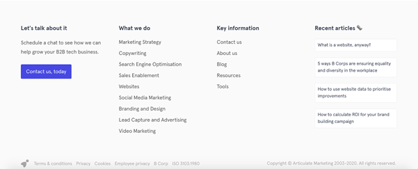
Their footer presents information and key pages clearly? If only they could do MY marketing!
Navigation
Unless your target customer is a tech-literate fox, you don’t want to send them on a wild goose chase. Your page structure should be as intuitive as possible, and there should be a clear hierarchy of information. In most cases, this means adopting what’s known as a ‘theme pyramid’ structure, which looks something like this:

The alternative – a ‘flat’ hierarchy where pages are all accessible at the same level – is confusing and can leave users wondering which information is important, and what can be skipped.
It makes sense, right? With ‘theme pyramids’, one category page leads to a more detailed page, which can then in turn dive even deeper into the subject. It takes users on a journey from general to specific, giving them a clear path to follow.
The added bonus? According to Google’s search shaman John Mueller, it’s the best structure to follow when it comes to SEO. Just make sure you cross-link between the different content silos on your website. It’ll spread the SEO juice evenly.
User-friendly optimisation
Your website shouldn’t just be user-friendly for the average desktop user. Taking the full spectrum of visitor profiles into account is crucial when working on your site’s usability. If you’re not taking mobile into account, for example, you’re potentially sacrificing around 52 percent of your potential traffic. Here are some basic steps to take when it comes to optimising your site for mobile visitors:
- Test your site for mobile-friendliness with this tool.
- Use Google’s AMP system.
- Design mobile-specific CTA variations.
- Cut your website’s page speed down as much as possible.
- Use or design a theme that has a mobile variant.
Smartphone surfers aren’t the only group you should consider when improving your website. As much as 20 percent of your traffic could be coming from users with disabilities, so ensuring your site is easily accessible to all isn’t just the right thing to do, it’s better for business. For more advice on this front, here are the official Web Content Accessibility Guidelines.
Analytics
You won’t know if your optimisation efforts are working if you don’t keep track of the numbers. Using analytics tools will allow you to monitor successes and failures, making iterative improvements more informed. Here are some of the best to get started with:
- Google Analytics is a fantastic all-rounder. It tracks everything from time spent on pages to the keywords that got them to your site. The standard version is free and will get you very far.
- Google Web Optimizer allows you to A/B test changes on your site. You can isolate different elements of your pages and find out what works best. Guess what? It’s also free.
- Compete and Ahrefs both allow users to track their performance when it comes to keywords – and to track their competitors. It’s a great means of understanding what others are doing right, and to locate gaps in the SEO market.
Put yourself in the shoes of your users when you’re structuring your website. What do you like to see on a website? Would you be confused if pages weren’t grouped under relevant categories? Chances are, your answers will be the same as the majority of your website’s visitors. Introduce some clarity, sort out your navigation, optimise for different kinds of users and track your progress. It’ll boost your traffic and increase your conversions.
Chapter 4: Why your website is rubbish at getting leads (or how to increase your conversion rate)
Getting conversions on an ill-prepared website feels a little like trying to get front-row seats to an Elton John concert – they’re impossibly difficult to source, and if you want them, you’ll have to pay through the nose. Here’s why you’re making it hard for yourself, and how to land your name on Elton’s guest list.
1. Your page takes too long to load
Page speed is one of – if not the – biggest roadblock between you and a healthy conversion rate. I know we’ve said it before, but it’s not just an SEO box-ticking exercise. It directly affects the number of people that will even see your website in the first place: an Akamai report found that a 100 millisecond delay can cause conversion rates to drop by 7 percent.
It’s worth taking the time to optimise your site for both desktop and mobile. Compress those images, sacrifice some animations and cache your data. It’s vital. Here’s a full guide, courtesy of Moz.
2. The important stuff isn’t front and centre
Make sure visitors know exactly who you are, what you can do for them, and why they should do it, as soon as they land on your homepage. Contact information (or a link to it) should be immediately visible, too. Why? A Nielsen study found that the majority of visitors will leave a page after 10 to 20 seconds, ‘but pages with a clear value proposition can hold people’s attention much longer.’
3. Your site’s structure isn’t clear
In much the same vein as the previous point, it shouldn’t be difficult for visitors to know where to go, and how to get there. The ‘three-click rule’ for websites may not hold as much water as it once did, but it’s still going to harm your conversion rate if it’s not clear how to get from A to B (or ‘homepage’ to ‘book a demo’). A lost visitor is a lost conversion.
It’s also important for SEO. If Google can’t crawl your site’s important pages in the ‘crawl budget’ your site is allocated, your site won’t rank as well and fewer people will find it on the search engines.
4. You’re not using landing pages
Wait, you’re not using landing pages?! They’re the bread and butter of conversions for your website. Without them, you don’t have as many ways to capture contact information and qualify them as a lead.
It’s the location of their first transaction with your business, too. They’re exchanging their email address, name, or job title in return for something of value – a white paper, for example – from you. Ensure they’re looking their best. As CRO experts done&tested note, asking small before asking big is a recipe for success.
5. You’re not making the most of lead gen tools
Make use of well-designed CTAs, pop-up forms and sidebar modules to call attention to your valuable offers and product demos. Is a visitor finding one of your fantastic blogs incredibly helpful? Be sure to showcase your newsletter subscription form in the sidebar so they can get more of your lovely content. Make sure to also offer the reader the chance to click your CTA, which is embedded in the copy, that leads to a downloadable offer. Make your value propositions as clear as possible without being intrusive.
Progressive forms are another useful way to learn more about potential leads. Gathering the same email address over and over again on different landing pages isn’t going to be that useful. Asking for more information (by using personalisation tags) with each free download means you can craft a more complete picture of your prospects, and target lead nurturing efforts more specifically.
Conversion rate optimisation is the difference between a boom or bust
If you’re not paying attention to CRO, you’re not paying attention to your bottom line. Optimising your website’s usability and lead nurturing can fill your sales funnel to the brim when done right – research has shown that companies dedicated to it can generate 50 percent more sales, and spend 33 percent less doing so.
So brush up your page speed, sort out your site’s structure and craft some landing pages. Your sales team will be so grateful, they might even buy you tickets to see Elton.
Chapter 5: The 3 ways brand and design make or break first impressions
Your website is a potential customer’s first glance into your company. It’s important!
Online visitors are coming to your site looking for some sort of value. If your brand isn’t portrayed properly and your design is all over the place the visitor will click off. Guess where they’re going instead? Yep, that’s right, over to your competitor’s website. Gone, in a split-second and they may never return.
Here are three things that will make or break your website visitor’s first impressions.
1. Clarity and consistency are key
Start with the goal of being clear and consistent on your company website. That way you’re immediately on the right track. Consistency in design and layout will solidify your company’s identity in the user's mind.
Ask yourself where potential customers enter your site? Is it organised? Does the next page they are likely to visit look similar? Does it follow a similar flow and have the same fonts, colours and style of images. These are the things that will make or break your company’s first impressions. Channel your inner Monica Geller and get organised.
Here are some top tips to keep your website clean and consistent.
- Use a maximum of three fonts
- Choose a simple illustration or photography style
- Make your content scannable
- Test different layouts and collect website data to find what works
The key to website brand and design is to start simple and add as you go. You’ll be surprised at what you come up with. It’s best not to go hell for leather. This will lead to you becoming overwhelmed pretty quickly. If you don’t want to get your hands dirty, find someone your company will work well with.
2. There’s just too much going on
Have you ever visited someone’s website and got hit in the face with 3 pop-ups, a video blasting sound and a cookie banner all at once? Not a nice experience, was it? Some websites instantly launch a sales offensive on their visitors. Today, this is (by our standards) unacceptable.
Here are some things to avoid:
- Instant pop ups. Pop ups can add value to a website visit, but you should time them so they're not the very first thing your visitors see. Tools like OptinMonster or HubSpot’s free pop-up tool can help you to build attractive, non-offensive pop-ups. Used correctly (and sparingly), these can and will increase your lead generation.
- Interstitials. On some websites, such as Forbes, the website visitor is redirected to a different page before they reach the content they clicked through for. As a general rule, this tactic is confusing and frustrating.
- Auto-playing multimedia. Thankfully, I see this less and less nowadays. But, some websites still have videos which pop-up and start annoying you until you find the source of the sound and close it.
- Too many animations. This can get confusing and lead the user’s attention away from the important information on the page.
These elements frustrate website visitors because they barrage them with information they haven’t asked for. Make a good first impression on website visitors: don't stress them out with unnecessarily aggressive design.
3. User experience and functionality
Visitors are top priority. Like a friend coming to visit, you want to make them feel at home. If your website takes an age to load and is difficult to navigate then you’re automatically facing a loss of potential leads and customers.
- Layout. Your website should be clean with an easy-to-follow navigation system to contribute to a usable web page layout. A layout that is easy to follow will give the site’s user simple access to valuable and important information. Content on the website should not be difficult to find. If they can’t find the content they’re after, visitors will get agitated and choose to leave the site.
- Speed and usability. We’ve said it time and time again: users get annoyed and leave slow websites. It’s a fact. Today, people value their time more than ever. Impatient or what? All jokes aside, there’s a ton of ways to increase your page speed. A simple task is to optimize your website images by reducing their size.
- Mobile responsiveness. More and more people search via mobile. Hence why it’s extremely important that your website works seamlessly on these devices. Some customers even use mobile-only. Most website building tools have mobile views available and some automatically create a mobile optimised version of your website, so there’s no real excuse.
Your website is an essential form of communication between your business and potential customers. It needs to tell them what your business is about. Does it communicate what the customer is expecting? Or is it one big unattractive mess? That’s where a web designer comes in handy. Find yourself a trusted partner and get stuck into the renovations.
Chapter 6: Showhome vs real home: how to keep your B2B site presentable
Perfection isn’t possible. You can get pretty close, though, if you keep tidying and iteratively improving your website on a regular basis. Your visitors will stay longer if your website is clear, big and bold, and search engines will be able to understand what your content is all about.
There are lots of steps you can take to ensure your site is kept clean, tidy and in tip-top condition for your visitors – whether humans or search engines:
Check for duplicate content
Duplicate content will have a harmful effect on your search engine ranking.
If there’s a lot of duplicate content on your website, visitors and search engines can get confused.
If you are adamant that there need to be multiples of the same content somewhere on your site, adding a canonical URL can help rectify any problems by prioritising one or the other.
Fix and redirect broken URLs
It’s essential that your website pages load properly and don’t return an error message. Your site’s URLs – and anything you’ve linked to on your pages and in articles – shouldn’t result in 404s. They must take your users to a useful, relevant piece of content.
Having broken links on your website looks bad, is annoying for visitors and will have a negative effect on your search ranking. There are plenty of tools that can help you easily identify broken links on your website. Articulate has even built its own tool for HubSpot users. For WordPress sites, you can install a WordPress plugin called Redirection.
What if the link isn’t yours to fix?
Say, for example, you’ve got a link to an external source which backs up a statistic or point you’ve made. You find out that the link in question isn’t working anymore.
What do you do? It’s time to replace it with something similar, or change the point and find another relevant quote or statistic.
Use headings correctly
Using headings in your content makes it more digestible for site visitors. They show your visitors what each section is about.
They also act as signposts for search engine crawlers and accessibility screen readers. Headings help provide a guided tour of how to read the content on any specific website page. It’s important to use them correctly.
Here are some rules to follow:
- There should only be a single H1 or title on any post or page
- Include your keywords in your H1 and H2 tags
- Headings are ranked in order of importance H1, H2, H3, H4 etc
- Always put the user first. Don’t keyword stuff.
A good rule of thumb is to make your site inviting to humans. Think about how people want to consume content, and make it easy for them to do so. If you do this, you’ll be pleasing the search engines, too.
Don’t forget image ALT text
ALT text is easily forgotten, but it’s what increases accessibility by providing detail for the visually impaired, and tells search engines what your image or illustration is about.
You might upload an image named ‘image-001.jpg’, and that automatically becomes the associated ALT text. Unfortunately, it doesn’t offer any information about the image. It can also leave your website’s storage folders in a bit of a mess.
When updating your image ALT text, it’s important to include keywords and describe what is happening in your photos or illustrations. This not only helps the user but can benefit your image organisation so they’re always easy to find.
A clean, uncluttered, working website is more attractive than a broken, densely packed, content-heavy one. Like a home, take it bit-by-bit. With some time and effort, you’ll have a presentable place for visitors to come, grab a cup of coffee and have a read of your valuable content.
Chapter 7: What to prioritise before a new website launch and what to do later
It may be tempting to jump right in at the deep end, creating a site replete with bells and whistles from the get-go. There are, however, a number of things that you need to prioritise when you first launch a new site – and other jobs that you can leave until later.
You're not likely to change a first-time website visitor to a customer all in one page, but you can do certain things to keep your visitors engaged. Getting that right out of the gate is critical.
Provide structure
When your new website launches, you need to present your visitor with a visually clear and logical framework. This requires a single-minded focus on your ideal client and a well thought through site plan. Organise your pages using a simple hierarchy, and cut out pages that don’t make sense within your site plan.
Keep it simple
A cluttered B2B website is not an attractive B2B website. Fortunately, tidying up your pages, toning down your content and making your site more readable is a pretty quick job. Don’t be afraid to add ‘white space’ to your pages, as this can help visitors to concentrate better on the content that matters.
Be careful though – refrain from using slideshows or carousels on your homepage. Trust us; your readers can only take in so much information before they get overwhelmed, so make any CTAs as clear as possible and leave them with the options.
Don’t overlook the blog
Well-written blogs talk about problems faced by your ideal website visitors, and how they can solve those problems. This kind of communication can be a driving force in increasing your website’s conversion rate. When the right visitor comes along, they'll (hopefully) find articles that solve their problems, want to see more, and might even get in touch.
Create downloadable content
Give your website visitors something for free that they can take away with them. If your visitors download content which they find useful, in exchange for an email address, chances are they'll come back for more and become qualified leads.
Optimise for conversion first
Once your site is optimised, you can start to think about adding more complex features. Flash is a no-no, but animations can bring your site to life once you’ve nailed the basics. If you’re also adding content that will take time to download, animations can liven up your visitor’s wait time.
With well over a billion websites out there on the big bad world wide web (almost 2 billion actually) your B2B business needs to fight for its own tiny space in the crowd.
Iterative website optimisation is critical if you want to stand out and not just fade into the background - it’s scary out there. Now is the time to get on top of the clutter and errors, and make a lasting impression on your website visitors. If you haven’t got the in-house resources to get started there are plenty of other options out there.
We’ve been doing this for a while, can you tell? Websites are our jam and we love to help where we can. To find out more about what Articulate could do to optimise your company’s website, get in touch.

[Editor's note: This blog was originally written in July 2016 by Rich Jinks, and has since been updated substantially between 2020-23. Contributors are Alex Cohen, Angie Browne, Aoife Porter, Callum Sharp and Maddy Leslie.]


.jpg?width=400&height=250&name=art-institute-of-chicago-wasoFWW8G1c-unsplash%20(1).jpg)
