Your homepage is the first port of call for prospective customers. This means it’s your first opportunity to tell them what you do and why they should care — and it might well be your only one. In a world awash with information, there aren’t a lot of second chances.
But in the B2B tech world, it’s not easy to build homepages that pull the user in and keep them there. Your product might be complex, with benefits that are hard to summarise, leading to an overloaded, jargon-heavy homepage. The result? Lots of traffic and little to show for it.
If this is you, then you’ve come to the right place. Our design team has analysed a wide range of B2B tech homepages to find out what works and what doesn’t. We’ve taken them apart, played around with the pieces, and tried to bolt them back together again. (What can I say, we like to get our hands dirty.)
Luckily for you, we’ve distilled our discoveries into 12 top tips for building a B2B tech homepage that will capture your audience and help you convert leads.
This article is based on one of our popular webinars, which was hosted by Articulate’s Specialist Designer, Ben Holness. View the video and download the slides.
1. Design your hero around your value proposition
Okay, let’s start with some definitions:
- The hero is the banner image at the top of your homepage — the first thing users see when they land on the page. At this point, you have between ten and twenty seconds before they click off for good.
- Your value proposition is what you’re offering, distilled to its essence. It’s the thing that makes you stand out from the crowd. It’s how you do what others can’t.
So, think of the hero as your ten-second pitch to keep the user scrolling. Here are a few pointers to make sure your hero really makes an impact:
- Keep the header short and sweet. Avoid lengthy copy and focus on the value you’re offering.
- Avoid abstract imagery. The images you use should have a direct connection to your product or service. Think dashboard screenshots, not cubes and cones.
- Ditch the video. Videos can slow down your page’s loading speed and affect your Core Web Vitals, which is bad for SEO and bad for the user.
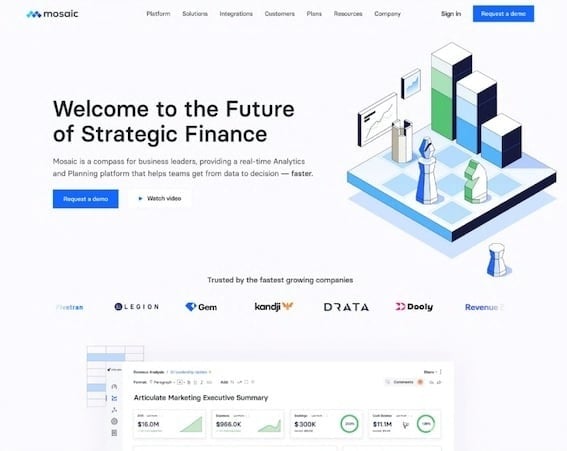
Here’s a great example from Mosaic. Their hero combines a dashboard view with branded graphics and clear, concise copy. (Notice those company logos? More on them below.)
Pro tip: let the section below the hero peek into view — it’ll help to build anticipation and curiosity.
2. Use your homepage as a ‘hub’ for your main pages
Your homepage is the place to tell people what you’re all about, but that doesn’t mean you need to tell them everything. Overloading your home page with content is a great way to scare off new visitors before they’ve even had a chance to get to know you.
Instead, make your homepage a hub that links to your other pages, with straightforward navigation to guide users to where they want to go.
Remember, not every page needs to be linked from your homepage. It’s probably not helpful to send users straight to your legal disclaimers. Instead, prioritise based on web traffic and conversion data.
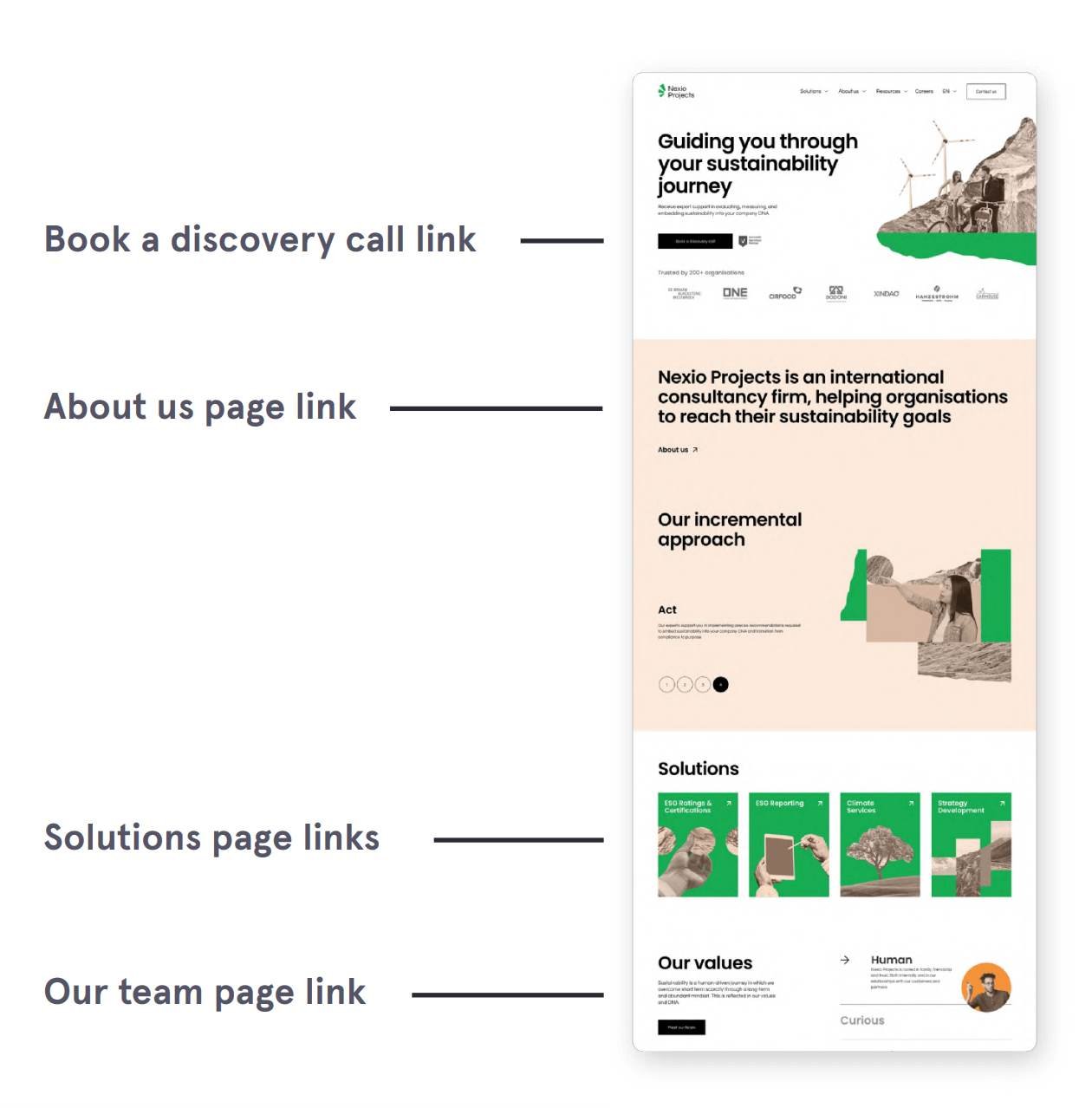
As you can see, Nexio Projects have done a great job splitting up their sections to link to the most important pages. Well done to them!
3. Lay out your copy in digestible chunks
Not sure if you have the right layout for your copy? The golden rule is to put function first. (Okay, there are many golden rules — but this is an especially nuggety-nugget!) Think about what your copy is trying to achieve, and this will help you decide what needs to go where.
Web copy is about getting people interested in your product. This means concision is key. You should:
- Avoid large blocks of text. Break essential elements into bullet points, subheadings, or icon cards.
- Make each section speak for itself. Everything should have to fight for its place on the page. Keep it lean and to the point.
- If in doubt, link it out. Remember, your homepage is a hub!
Another pro tip: take a screenshot of your homepage and draw a vertical line down the middle. You’ll quickly be able to see if it’s unbalanced, with too much copy on one side. If it is, try alternating the position of text and images.
4. Sprinkle in calls to action
Ah, yes, the call to action, more commonly known as the CTA. This is where you get to tell the user what you want them to do. Shop now! Get in touch! Book a call!
When it comes to converting users into prospects, the CTA is your trustiest tool. So, you’ll want to make sure they’re featured throughout your homepage.
But notice that word sprinkle. Yes, it’s a fun word, but that’s not why we used it. We used it because it’s important not to overdo your CTAs. Nobody wants to be hounded for a sale when they’re just idly scrolling through your website.
So, be sparing and try to make each CTA count:
- Vary up your button copy. Take the chance to try out different wording — just make sure it’s clear what clicking the button actually does.
- End with a bang. A bold and engaging CTA at the bottom of your homepage is a must. Don’t leave users looking for where to go next.
- Make good use of your header and footer. These are the same throughout most of your website, which makes them a great place for CTAs.
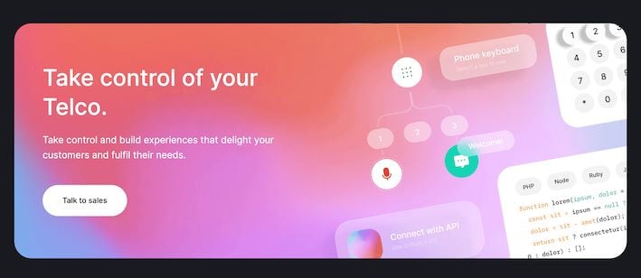
Here you can see a brilliant example from Enfonica, who’ve added an eye-catching banner to the bottom of their homepage. The vibrant colour stands out from the darker page theme, and the button has strong, simple copy.
5. Bin the slideshow carousel
We have to be blunt. If you have a carousel on your homepage, it needs to go. They hide content from your users, distract their attention, and affect page load times.
The one exception: testimonials. This is a case where more really is more. A carousel is an excellent way to fit more positive feedback on your homepage without making it feel bloated.
Exceptions prove the rule. So, delete that slideshow!
6. Keep the mobile user front of mind
Estimates suggest that over half of all web traffic is on mobile devices. While this may vary depending on industry and location, the reality is that if your site isn’t optimised for mobile, you’re in serious trouble.
To help out your mobile visitors, you should:
- Use media queries. These let you vary your page layout depending on the display dimensions. Ask your knowledgeable web developer for more info.
- Use a hamburger menu to replace your desktop header navigation.
- Optimise imagery for mobile. If your images are too large, they’ll take longer to load. Which — and we cannot stress this enough — is a bad thing.
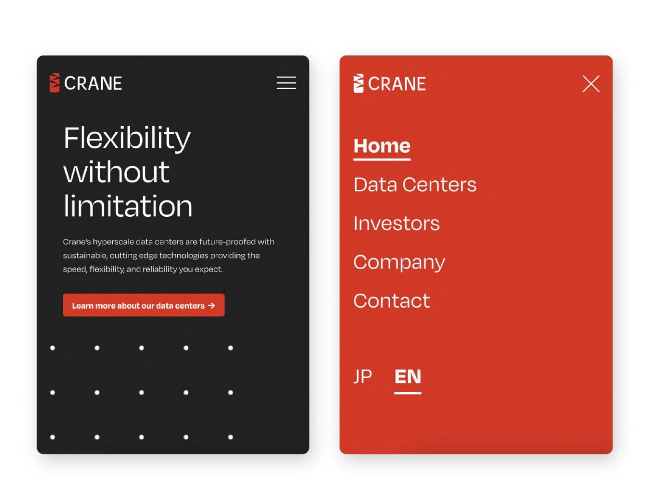
Crane has provided a perfect example of how a hamburger menu can help mobile users easily move around your site. You can probably imagine what trying to cram all those headings into a navigation bar would look like on a small screen.
If you’re unsure how well-optimised your site is for mobile, try out Google’s handy free tool to give you a quick overview.
7. Use pictures to say a thousand words
Sure, it’s a cliché, but it’s also true. In fact, it’s a cliché because it’s true! Images can help you convey your message simply and effectively without the need for big blocks of text.
This isn’t an excuse for filling your site with any and every picture you can find. The picture might be saying a thousand words, but is it something you wanted to say in the first place?
Unrelated images can do more harm than good, detracting from your message rather than clarifying it.
8. Look at your competitors’ homepages and deviate (within reason)
You want to stand out, right? Well, the simplest way is to look at what everyone else is doing and then do… something else!
For instance, are all your competitors using carefully posed photographs on their homepage? Well, why not try custom illustrations instead? They can help you highlight your brand identity while marking you out from the crowd. It’s a win-win!
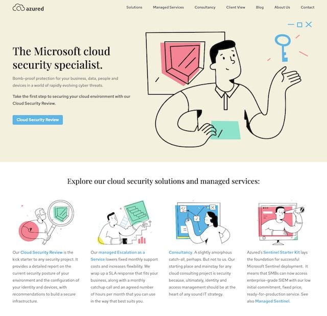
This is precisely what we did for cloud specialists Azured. And it looks extremely striking if we do say so ourselves!
Of course, you want to stand out for the right reasons. ****In the B2B tech industry, at least, not all publicity is good publicity. Don’t deviate into something off-putting or difficult to understand just to be different.
9. Add social proof
Humans are simple creatures — we seek safety in numbers. Recommendations and reviews give us comfort, reassuring us we’re not about to pour our money down the drain. This is what we call social proof.
In a B2B context, you’ll want to focus on client testimonials, case studies, and accreditations. Some of these can be linked out from your homepage (remember tip two!), but accreditations and client logos work great as part of your hero.
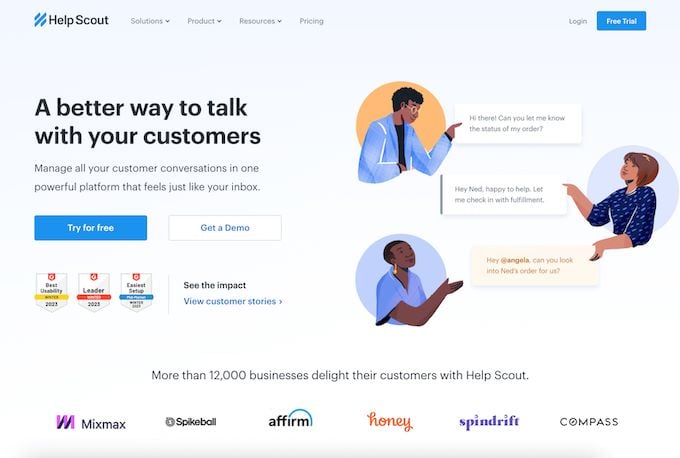
In this example, Help Scout uses accreditations and client logos in its homepage hero to start building trust from the get-go.
10. Promote your content
At the heart of the inbound methodology is offering value. Giving users educational and enjoyable content is a big step toward getting them interested in your offering.
But an insightful blog or a slew of educational resources aren’t much use if users need to dig to find them. Your homepage is a great place to highlight your content, helping you build trust and credibility quickly.
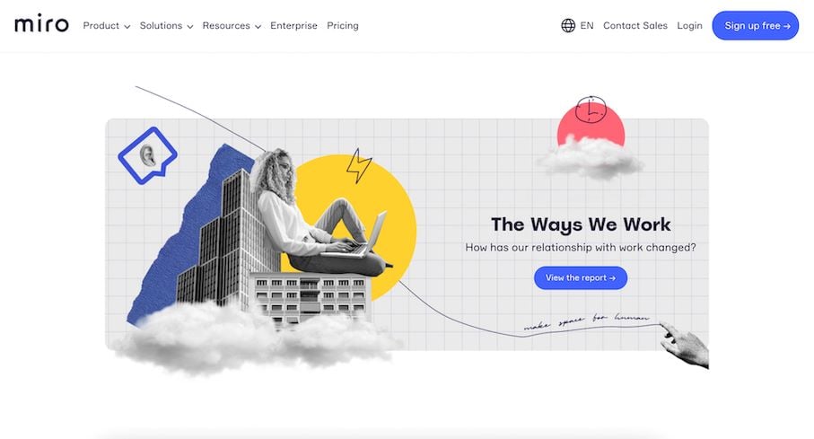
Here, Miro has added a prominent banner pointing users to an in-depth report full of interactive elements and valuable data. Looks inviting, no?
11. Add embedded interactivity
If you want users to engage with your homepage, why not give them something to play with? Calculators, product recommendation quizzes, and other interactive tools are great ways to encourage users to stick around and find out more about what you’re offering.
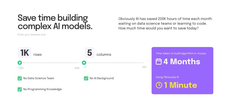
Here, Obviously AI has embedded a calculator into the homepage to let users see just how much time they can save, distilling a complex product into a tangible business benefit.
12. Use animations sparingly and with purpose
Animations look cool. We all know this. But (whisper it) being cool isn’t always the most important thing in the world. If your flashy animations distract the user from the things you really want them to focus on, then they’re not going to help you hit your business goals.
As a rule of thumb, only add animations that improve the user experience and make your interactions more intuitive. A button that changes colour when the user hovers over it? Fab. A constant whirlwind of spinning shapes and shifting elements? Grim.
Need more tips? Get in touch!
Your homepage has a lot riding on it. When it comes to turning a curious visitor into a customer or even into a long-term advocate for your business, your homepage has a major part to play.
That’s why it’s important to make sure your homepage is a supercharged selling machine. You need it fully optimised, carefully designed, and ready to inform, engage and delight every single visitor.
Not sure where to start? We offer web design and development services for tech companies who want to go further, faster. Get in touch to find out how we can help.
