
66 percent of web users expect a website to look visually appealing. But, what does ‘visually appealing’ even mean?
After all, one person’s Picasso painting is another person’s toilet paper. Art is subjective. Website design is subjective, too. And, like fashion, website design is governed by changing trends.
In this blog post, we outline the five design predictions for B2B technology companies in 2020.
1. Less is more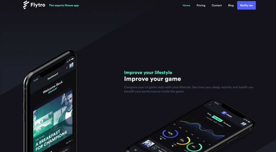
In 2019 and 2020, we’ll see less information on B2B technology websites. In this overcrowded information age, those websites with short, relevant copy will prosper. Guaranteed.
To be able to convey their messaging in just a few words, B2B technology companies will need to be sure about who they are and what they’re selling. Remember, less content requires more context.
In short…
Expect to see more simple designs and more whitespace.
2. Animated and coded calls-to-action
54 percent of people don’t click on banner ads because they don’t trust them, and 33 percent of internet users find them completely intolerable.
In 2012, it was reported that a typical U.S. internet user saw 63 adverts per day. It’s likely that figure has increased. Consequently, people are subconsciously ignoring ad banners. Your ability to convert a blog visitor into a lead with a standard call-to-action (CTA) is quickly diminishing.
Animation, then, is the answer. We predict that in 2019 and 2020, we’ll see more website animation and custom-coded calls-to-action on B2B technology websites, which will help drive leads. We’re already seeing quirky pop-up forms like Neil Patel’s interactive ‘spin to win’ pop up (which, by the way, is a WordPress plugin). It’s only a matter of time before advertisements become more hands on.
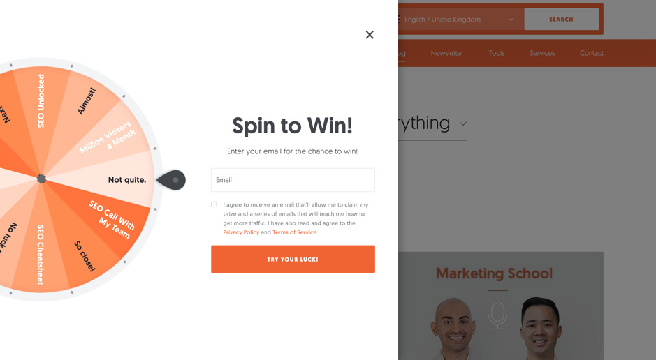 Credit: neilpatel.com
In short…
We can expect to see more interactive advertisements and calls-to-action. Soon, the internet will become one big subliminal game.
3. Lots of colours
A great way to stand apart from the competition in the B2B technology world is to use bold colour patterns. We’re seeing big players like Dropbox, Asana, Monday and HubSpot use bright, vibrant colours to make themselves more approachable to customers, and to help these businesses gain attention.
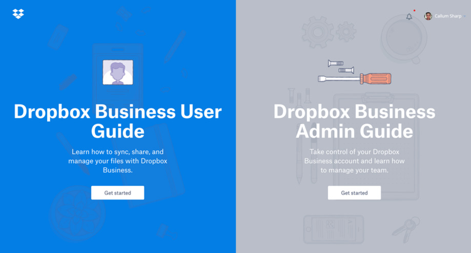 Credit: dropbox.com
Technology doesn’t have to be sterile and inhuman. Your B2B technology company can still be professional and sell to serious decision makers, while showing personality and quirkiness at the same time.
In short…
The slick silver and matt black colours that are associated with technology are quickly disappearing, and more vibrant colours are replacing them.
4. Bespoke illustrations
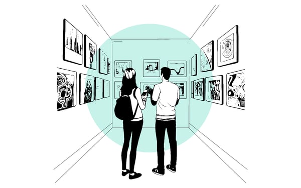
Stock images are dead. We probably don’t need to reiterate this point, but Unsplash, Pexels, Adobe Stock and Shutterstock are declining, and custom illustrations (like on the Pitch website) are rising.
Bespoke agency illustrations are more cost-effective, efficient, eye-catching and Google-friendly assets that B2B technology companies will soon embrace. And, designers can build fast-loading images at the correct file size, so using these images is likely to improve your page speed as well as keeping your creative people happy.
 In short…
Don’t let the above photo represent your business. No team looks like this. It’s not just boring; it’s an obvious lie.
5. Anything but Google fonts
Like stock photos, your mainstream font types like Helvetica and Times New Roman are also dead. To stand out from the competition, you need to do one of two things:
- Source and pay for a unique, clean and easily readable font from somewhere on the internet (like Adobe Typekit); or
- hire an agency to design a custom-made font for you.
In the next few years, generic fonts like Roboto, Montserrat and Open Sans will brand your business clichéd, impersonal and, well, ‘just fine’. And trust us, you want to be anything but ‘just fine’.
In short…
Put some effort into researching and testing a font that works for you and your customers and do what you can to make it unique to your business.
Invest in design, and visitors will invest in you
The biggest challenge that faces B2B technology companies is competition. Whether that’s competition for sales between other companies, competition for the top spot on Google, or competition over attention spans, you need to find new and unique ways to stand out. This is the key that unlocks growth.
A good B2B technology website, then, is designed with user friendliness at front-of-mind. It’s designed to be clear and concise in what it’s trying to say. It’s designed with unique, quirky and tested features in strategic places. More importantly, it’s designed to be relatable and human. We’ll end with a quote from Einstein:
‘Everything should be made as simply as possible, but not simpler.’

We recommend reading these articles, next...
A picture worth a thousand words: How to create a design language for your brand
Learn how brand design can give your business a competitive edge. Explore the components of a...
Why accessibility is crucial for website design
Uncover the importance of inclusivity, compliance with regulations, and the benefits of simple,...
5 of the best B2B FinTech websites
Learn from the best of the best FinTech websites, and discover how you, too, can have a stunning...