An effective call-to-action is critical to inbound marketing. Get it wrong and your content-driven inbound marketing strategy could fail.
Make sure you create a clickable call that will convert visitors into viable leads.
Start by attracting the right visitors to your site
Before you can convert visitors into leads, you have to attract those visitors to your site. This is done by generating good content that means something to your potential customers.
Well-written content that addresses the questions and interests of your buyer personas will draw them to your site and then it’s up to you to follow it up with a call-to-action worth clicking.
1. Offer something of value
In the case of content marketing, the call-to-action usually comes at the end of a blog article, case study, or other piece of content.
Every call-to-action offers something to the visitor and, just like the content, the offer must hold value to your ideal buyer. To make sure the offer is worthwhile for the reader:
- Target the same buyer persona as the content. For example, if the topic of a blog article targets a startup entrepreneur, an ebook or whitepaper on startup marketing or equipping a startup in the cloud would make sense.
- Match the stage of the buyer process. Avoid offering too much too soon (or too little too late). Learn what content requires an offer like an ebook aimed at the early stages of the buyer process or an offer like a consultation or a pricing guide for a buyer closer to making a decision.
Your whole marketing team needs to realise that the call-to-action is a critical part of meeting your marketing goals using inbound strategy and learn how to make the call effective.
Once you have content to attract visitors and an offer that appeals to them, it’s essential to use copy and design that will catch the reader’s eye.

2. A clickable shape
The design of any call-to-action needs to appear clickable and this is best done with a button.
For example, check out HubSpot’s call-to-action:
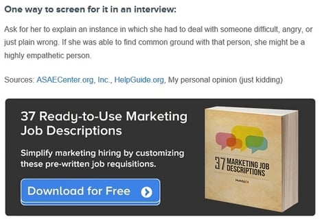
The button in this offer makes it obvious the visitor should click to receive the offer, but there’s another aspect of this call-to-action that makes it effective.
3. Contrasting colour
Despite extensive research, there is no one magical colour to up conversions. What is important is colour usage and contrast.
For the call-to-action to draw attention, make use of white space and contrasting colours like the HubSpot example above with a bright blue button on a dark banner sitting on a white background.
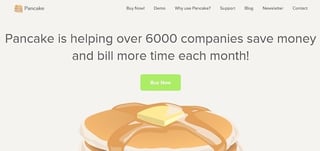
The example below, from Pancake’s main page, uses contrast to highlight the call-to-action button:
4. Complementary font
Just like with colour, a font that is different from the rest of the text on the page will emphasise the call-to-action.
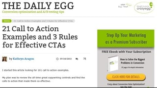
Take a look at this example from The Daily Egg where the colour and font contrast the rest of the page to make it standout:
5. Actionable wording
The copy in your call-to-action is just as vital as its design. A call-to-action requires action words like:
- Download
- Attend
- Sign up
You also have to be clear about what you're actually offering. For example:
- Download your free ebook: Social media for the small business
- Attend the webinar: How to market on a shoestring budget
- Sign up for a free 30-day trial
Avoid language that isn’t clear and straight-forward. No one's going to act on this: ‘If you’re interested in learning more, consider downloading our ebook … .’
6. Prime real estate
You can place a call-to-action at the end of a blog, in a sidebar, on a home or product page or religiously above the fold but, wherever it is, it’s best to:
- Avoid placing competing offers next to each other
- Make sure the call-to-action is at the forefront of the page design
- Use directional cues such as arrows to guide visitors to the offer
- Avoid placing a call-to-action in a cluttered area of the page
7. A/B testing
There are things that don’t work in a call-to-action, but there’s no single magic colour, font, wording or placement that converts for all companies. So the most important step is to conduct A/B tests to see what visitors to the site actually respond to.
Create the same offer with variations in colour, font, wording, placement or size. For example, you may create a blue version and a red version. Test which gets more clicks and conversions and then use those results in future offers.
As you learn which call-to-action variations work for a brand, you’ll be able to create the most effective call-to-action every time and generate more viable leads to nurture into customers.
(Hat tip to Wikimedia Commons for the photo)

.jpg?width=400&height=250&name=birmingham-museums-trust-8wcoY3wcbL0-unsplash%20(1).jpg)


.jpg?width=400&height=250&name=art-institute-of-chicago-pybByTGQ9zI-unsplash%201%20(1).jpg)