 Posted by
Maddy Leslie
Posted by
Maddy Leslie
Watching the growing market of FinTechs shed the button-down financial services look is as electrifying as Sandy’s transformation at the end of Grease. We can’t help but cheer: you go, girl!
This article used to exist as one of our gated resources, but we've unleashed it from its shackles and now you can read it here, for free. Download the PDF version using this form:
What we mean to say is we’re seeing brands go from stuffy and boring to fun, approachable, playful, sleek and sassy. It’s not to say they haven’t kept that professionalism you want when engaging with money matters, but the FinTech world has wakened to the idea that financial B2B marketing is still, at its heart, person-to-person.
To differentiate from the crowd, your business needs to appeal to individuals. They will become the internal champions of your services in their organisations. That’s how you get a foot in the door to open up a sales conversation. And that process — often — starts with your website.
Our team has picked out a few FinTech websites that we admire. Find out what you can steal, draw inspiration from, where these sites can improve and what we think about website design for FinTechs. Plus get your own checklist (at the end) to assess your existing setup. For an interactive version of this checklist, use the form above to download the full PDF version of this content.
Have you made our illustrious list? If not, never fear. Learn from the best of the best FinTech websites, and discover how you, too, can have a stunning AND effective B2B website.
Admire the biggest fish in the pond with Stripe
Stripe is a global software and API provider for small to large organisations to accept payments, send payouts, and manage their businesses online.
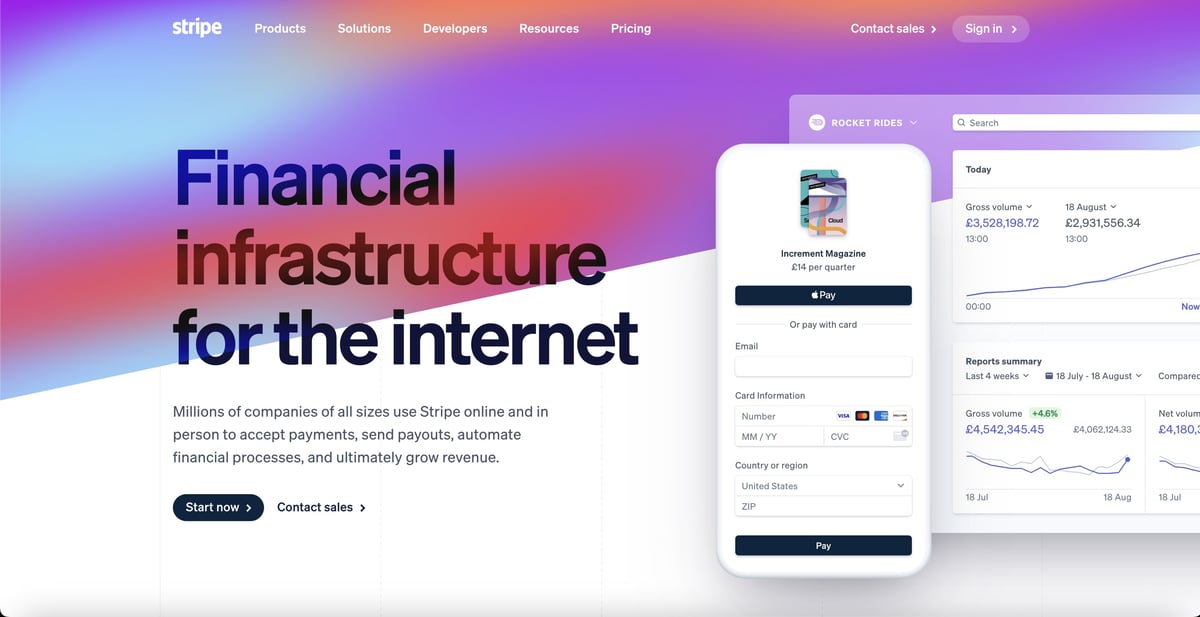
Brand style
Expansive and playful, while remaining grounded.
Best features
The style captures the fact that Stripe is a multi-national provider. To showcase this range, the site uses an extensive ‘rainbow’ colour palette, subtle animations and client logos. The main navigation menu is deceptively simple for such a large site, but there are plenty of opportunities to dive into specifics across verticals and products both here and on-page.
The crisp sans-serif font and use of white space provide balance, ensuring the illustrative product demos and graphs are easy to understand. This lends the software authority and builds a reassuring sense of its utility for multiple use cases, especially when considered alongside impressive numbers of customers using Stripe.
Areas for improvement
The blog is categorised by ‘Corporate’, ‘Engineering’ ‘Industry’ and ‘Product’. This makes it very Stripe-centric and role-focused. We’d suggest content aimed at drawing in site visitors who don’t know Stripe and who are simply looking for information around relevant topic areas and keywords. We’d suggest SEO-driven content on enterprise finances and customer satisfaction. The ‘Industry’ section looks like it’s moving in the right direction… though currently only houses a single blog entry.
Recommended reading:
The ultimate SEO guide for B2B technology companies
Get scrappy small business vibes with ANNA Money
ANNA Money is a small business account and debit card provider. They do your invoicing, track your expenses and sort your company taxes. Oh, and ‘ANNA’ stands for ‘Absolutely No-Nonsense Admin’.
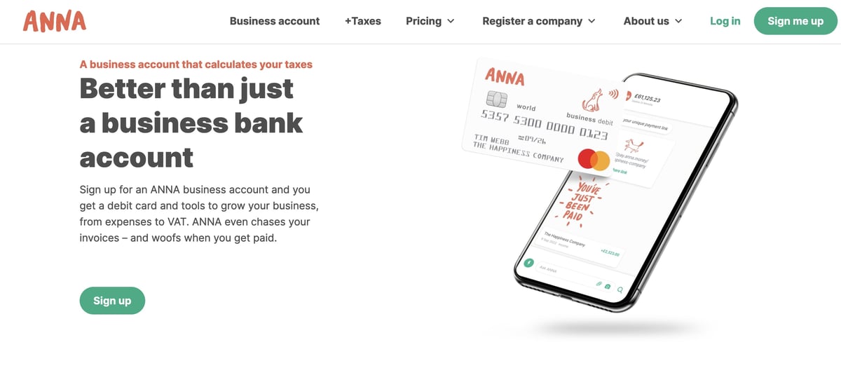
Brand style
Welcoming and unassuming chalkboard antics.
Best features
Our stand-out favourite thing about this website is all the chalkboard-style illustrations. They’re like Easter eggs. You want to explore the site just to find the next one. From dinosaurs in roller-skates to a pigeon on an iPhone, these characters reflect the equally characterful nature of their target audience: small, scrappy businesses.
This style extends to their blog, where they have a variety of content from company news and guides to quizzes. They prompt you to download the app throughout the blog and website, and you can subscribe to their blog for weekly updates.
Areas for improvement
Blog subscriptions and buttons to more content on the site make for a fantastic starting point. To take it one step further, we’d suggest implementing calls-to-action (CTAs) and landing pages with forms that prompt the site visitor to exchange their email address for access to premium content. They already have some great guides they could update and use for this purpose.
This puts contacts into a database where they’re primed for lead nurturing and sales conversations.
Recommended reading:
101 B2B lead generation tips for inbound marketing
Get your weird and wonderful on with Cash App
Cash App is built by Square. The easiest way to send, spend, save, and invest.
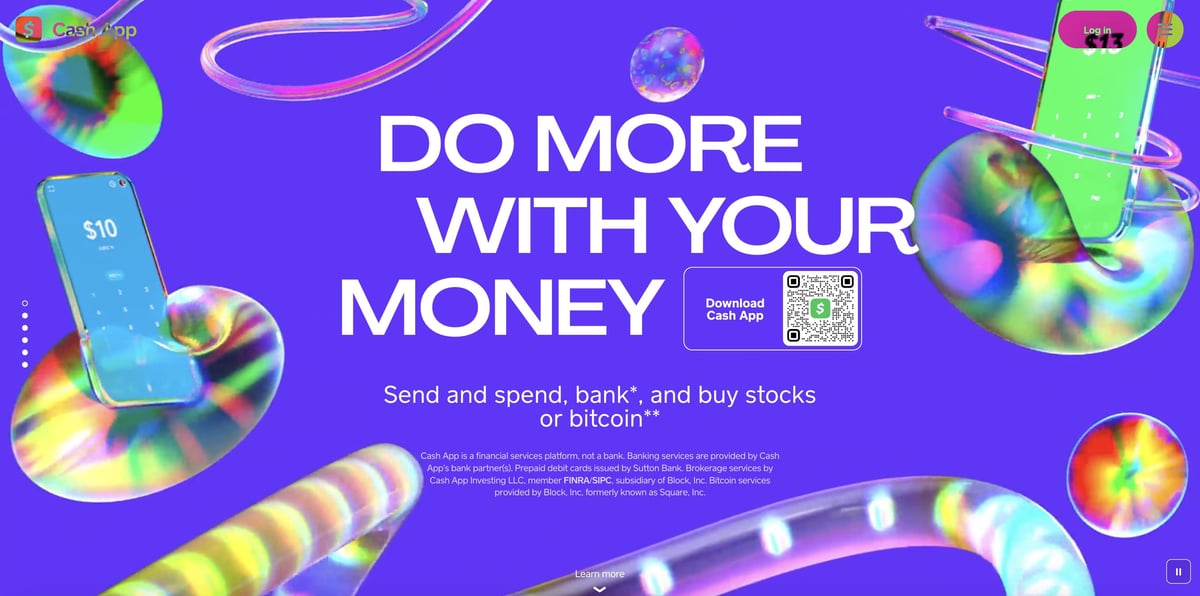
Brand style
Lovecraft meets Escher.
Best features
While Square’s own website is... fine (shots fired), Cash App enters a whole new territory of weird. We’d like to meet the minds that made it. It’s got it all. Blocky comic book headers (if they’re not even more zany, like this). Lurid green highlights your teenager wants to get for their birthday. Stark, shadowy pillars reminiscent of the colour wash after a nuclear blast. An all-seeing eye.
You know, the stuff you usually see on FinTech websites.
Areas for improvement
There are barely any navigations to speak of. No blog, no pagination from links in the footer. There’s just so much potential for this site, and we want to see it grow over time into a great and many-headed beast... ‘and with strange aeons even death may die’...
Recommended reading:
The complete guide to website marketing
Wander through a zen garden at MANTL
MANTL helps your bank or credit union grow deposits and streamline back-office tasks with an omni-channel account opening platform that integrates with your core.
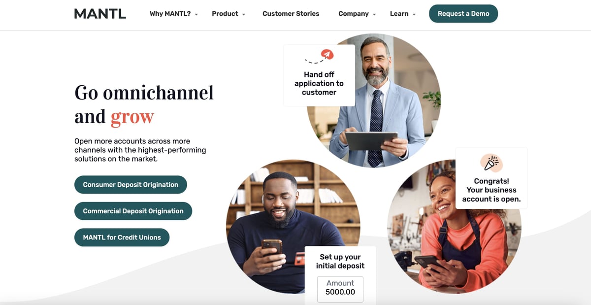
Brand style
Calming, natural and slick as a magazine.
Best features
Ooooommmm... Sorry, we were zoning out staring at MANTL’s homepage animation. We seriously love the clear zen garden brand story here, with textured nature-inspired shapes and colours. This, combined with authoritative serif headers and a spacious layout, makes you feel calm - and, well, like your finances are in safe hands.
There’s some nice attention to detail. For example, the main navigation transitions are pleasant and intuitive. Very subtle animations give the pages a premium feel. The blog is attentively categorised to appeal to their different personas.
Areas for improvement
Speaking of detail. Where’s the favicon, people? A small point, but it irked us. We love the style, but the copywriting... that’s where you lose us. This is a common problem in B2B FinTech. They’re happy enough to concede ground on a more modern website design story, but they hold onto jargon-filled, acronym-heavy copy like it’s going out of fashion (which it IS!).
It’s by no means the worst example we’ve seen, but this FinTech definitely needs to tone down the technical language and spice up their content.
Recommended reading:
What does a copywriter do? Your copywriting guide
See the future through an artist’s lens with Tomorrow
Tomorrow is a German banking and investment service that uses your money exclusively to invest in sustainable projects.
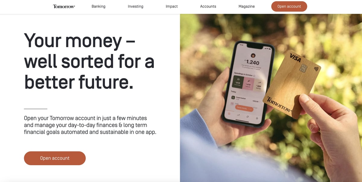
Brand style
Oil on canvas and bright horizons.
Best features
This website is, genuinely, a work of art. The messaging, ‘banking for a better future’, is reinforced throughout every page with value-driven copy. This human-first, sustainable, forward-facing narrative is supported by a design story that relies on the blues, golds and sunset oranges of dawn. And, the cleverly integrated use of oil paintings, complete with canvas texture speaks to the pricelessness of our planet.
Oh, and like Articulate Marketing, they’re a B Corp. That is, a business certified as a force for good.
Areas for improvement
Although they offer lots of support, FAQs and content for site visitors at all stages of the buyer’s journey, they don’t have nearly enough conversion opportunities. Their ‘Magazine’ (blog) would really benefit from another layer of content — whitepapers, calculators, guides — something to add depth to their informative offerings, while also bringing contacts into the database.
Recommended reading:
Free guide to building awesome B2B landing pages
Honourable mentions
Cleo - It’s B2C. But baby what a website. Aimed at ‘the youths’, with a pizza cursor, tentacles, and eye-watering neons, you can’t help but love-hate it. Given their AI app actively roasts your poor financial decisions, that was most certainly the goal.
Sezzle - Shout out to another fellow B Corp. Sezzle makes great use of white space throughout, which makes the site feel clean and put-together. But their blog is on a different domain - why?!
Sunrise Banks - Although the website design is functional, it’s a little dated. But we’re loving the ethical banking and inclusive messaging. This shows an arrow-straight alignment between the mission and the website.
Bambu - Their digital wealth management site could use some work (the ‘flying purple people eater’ comes to mind) BUT we absolutely love the psychedelic illustrations on their blog.
Riskified - It’s fun and funky but there’s a risk (see what we did there) to employing so many clever animations: your PageSpeed gets hit. We clock it at 36/100 on mobile. This is how you lose SEO clout, given Google is prioritising core web vitals.
Your take-home checklist for FinTech web design
So what have we learned? Let’s summarise. Use this handy-dandy one-page checklist to assess your website. (Grab the image below or copy the written list underneath.)
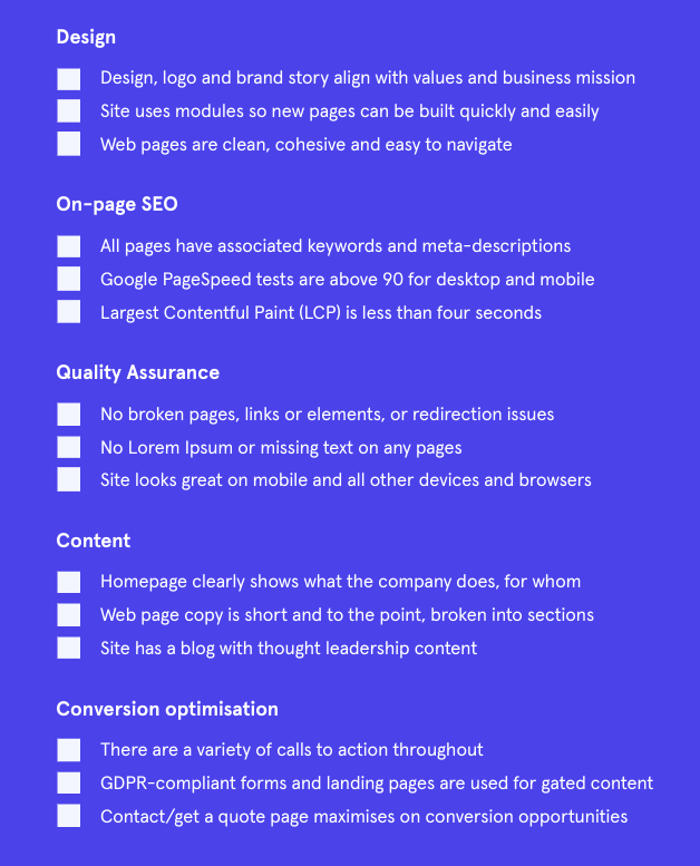
Design
- Design, logo and brand story align with values and business mission
- Site uses modules so new pages can be built quickly and easily
- Web pages are clean, cohesive and easy to navigate
On-page SEO
- All pages have associated keywords and meta-descriptions
- Google PageSpeed tests are above 90 for desktop and mobile
- Largest Contentful Paint (LCP) is less than four seconds
Quality Assurance
- No broken pages, links or elements, or redirection issues
- No Lorem Ipsum or missing text on any pages
- Site looks great on mobile and all other devices and browsers
Content
- Homepage clearly shows what the company does and for whom
- Web page copy is short and to the point, broken into sections
- Site has a blog with thought leadership content
Conversion optimisation
- There are a variety of calls to action throughout
- GDPR-compliant forms and landing pages are used for gated content
- Contact/get a quote page maximises on conversion opportunities
If you want to learn more, get an in-depth score and access to resources using our free website tester. Or, go straight to booking a quick chat with one of our consultants.


-1.jpg?width=400&height=250&name=art-institute-of-chicago-srEIl5A91TQ-unsplash%20(1)-1.jpg)