Typography affects your credibility
Errol Morris carried out an experiment on New York Times readers. Presenting the same information in different fonts, he tested how credible it seemed. Roughly 40,000 people responded to his quiz and it turned out that even small differences between apparently similar fonts had a big impact on believability. (Hat tip: The Week.)
The difference between Baskerville and Georgia was a jump of 1.5 percent. Not huge in itself but considering that it takes one click on the font menu to change from one to the other, you can see how important the choice of font is.
Dress for the occasion


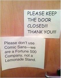
You wouldn’t wear a onesie to work, so don’t use Comic Sans in business. In fact, Morris says: ‘The conscious awareness of Comic Sans promotes — at least among some people — contempt and summary dismissal.’ Just check out these hilarious logos of famous brands, redone using Comic Sans.

With Comic Sans, it’s not rocket science any more. (Source: CreativePool.)
The only exceptions I’ll admit is if you work in the comic book industry (but I bet they don’t use it either) or if you’re a complete genius who discovered the Higgs Boson, in which case you can do whatever you like.

Don’t use BLOCK CAPITALS
We recognise words largely from the shape they make rather than from the collection of shapes of the individual letters in the words, according to Kevin Larson, a researcher in ‘Advanced Reading Technology’ at Microsoft. (Full disclosure: Microsoft is an Articulate client.)
In other words, we see this:


Not this:


We see words. Letters, not so much. (Source: Microsoft)
The ascenders and descenders help us differentiate the words. But using ALL CAPS means that these vital clues are eliminated and the only visual difference between the words is their length. It increases the cognitive load on the reader’s brain, as anyone who has read a contract preamble or an internet rant in all-caps will attest.
How people read
We don’t read in a continuous flow. Our eyes jump along a line of text like a small child hopping on hot sand in a series of saccades intermingled with short stops called fixations.

How much we take in with each eye fixation. (Source: Wikipedia)
Sometimes we jump back when we miss something or don’t understand it. When this happens, there’s a double risk: you reduce comprehension and your reader may just stop reading altogether. Ouch!

Saccades, fixations and back skips. (Source: Microsoft)
This means you want to avoid things that slow people down or force them to jump back through incomprehension. Typographical speed bumps include:
- Foreign words
- Italic text
- All-caps text
- Long quotations
- Excessive punctuation (one reason why we now write ‘eg’ not ‘e.g.’ etc)
- Unnecessary capitalisation, which is very common in the tech industry
- Acronyms and abbreviations
Choose narrower columns
The wider the column of text the harder it is for a reader to keep their eyes on the same line as they skip along it. This is one reason why newspapers and magazines are printed using narrow columns.
You can test this out for yourself by printing the same text across a page in landscape, portrait and then two and three columns per page. Which is easier to read?

The effect of line width on readability (Source: Fonts.com)
You want your readers to read more of your text? Then use narrower columns! A good guideline is between 9 and 12 words and about 35 characters per line for unjustified text.
Choose serif fonts for legibility
It’s a common understanding that serif fonts (such as Times New Roman) are more readable than sans serif fonts (such as Verdana). This is borne out in a study by Jacob Palme which found Times New Roman increased reading speed by 7.45 percent.
Fonts do graphs too
Today’s fonts are almost like programming languages and they are incredibly flexible. For example Chartwell lets you create different kinds of charts simply by typing stuff like '5+7+10+4', selecting the numbers you typed and choosing the Chartwell font. Magically the text turns into graphs.

Stand back
I did a ten week evening course in typography at Central St. Martins. One of the most valuable things I learned was to stand on my chair and look at text from a distance. This is the best way to see the ‘colour’ of the text on a page and the layout and structure of text.
Learn the rules
Check out this free online book about typography. Improving your typography is one of the easiest website design trends you can do to improve your content marketing. As Butterick says, ‘typography can optimize your writing. Typography can create a better first impression. Typography can reinforce your key points. Typography can extend reader attention’.
For lazy readers, there's even a great section titled 'Typography in ten minutes'.


We recommend reading these articles, next...
A picture worth a thousand words: How to create a design language for your brand
Learn how brand design can give your business a competitive edge. Explore the components of a...

Why accessibility is crucial for website design
Uncover the importance of inclusivity, compliance with regulations, and the benefits of simple,...

5 of the best B2B FinTech websites
Learn from the best of the best FinTech websites, and discover how you, too, can have a stunning...