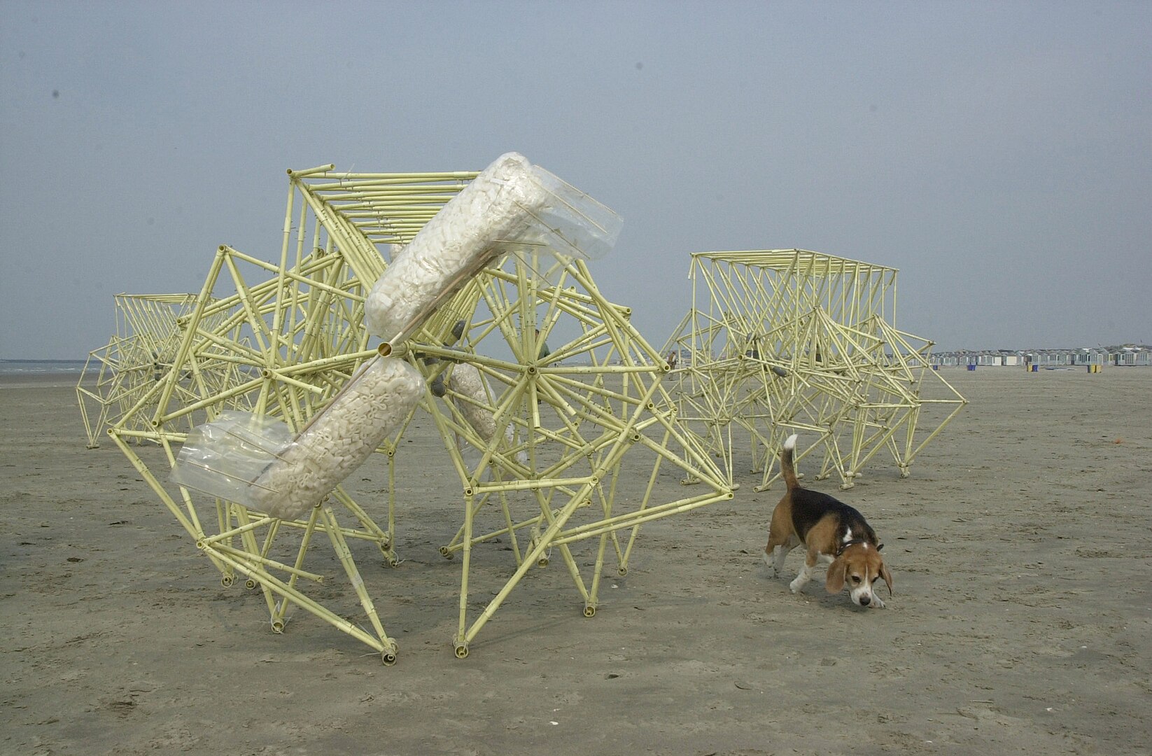
If you’ve ever seen artist Theo Jansen’s work, you’ll understand how effective (and impressive) it can be when design and engineering harmonise. The wind-powered motion of his Strandbeests looks effortless, but they require meticulous planning and work to achieve.

B2B websites aren’t wind-powered (not directly, anyway) but to make them more than a digital display board, they need a similar approach. All the core elements and connecting parts need careful thought and implementation to maximise your return—better brand equity, more leads and more sales.
So how do you make a website that powers your sales and marketing efforts? This article has the answers, sharing our process for designing and developing signature websites, from strategy and sitemapping to quality assurance (QA) and launch.
Our approach to designing and developing websites: The Difference Engine®
We use a proprietary framework for marketing and brand differentiation best practices called The Difference Engine®. It’s our blueprint for a better business that helps you power growth, optimise your marketing and sales funnel and move forward.
With our signature websites, we work towards clear and compelling differentiation at every level. From the sitemap to the colour palette to the module design, we design for SEO, brand impact and conversion.
We don’t go against the grain for the sake of it, like flouting regulations or well-tested best practices. But we do push the envelope to help your business stand out, reach and engage more of your target customers, and grow market share.
Our website packages
If you’ve never managed a website project before (and sometimes even when you have), defining exactly what you need can feel overwhelming. It’s your company’s digital frontage, so first impressions matter, and your website may be even more important than your logo. But you also have to consider user journeys. Making the experience seamless gets buyers what they need, where and when they need it, to drive conversion.
At Articulate, we have three signature website packages to help bypass the unwieldy task of scoping a website project from scratch and cut straight to your business needs: Starter, Pro and Enterprise.
- A Starter signature website is for startups and SMEs operating on a lean budget or companies that only need a small website on a shorter timeline with simple styling to match your brand. We build it on our proprietary Nucleus framework, which embodies 10+ years of website R&D.
- A Pro signature website is for small but ambitious or mid-market companies who understand the importance of a differentiated website design for brand equity, lead generation and conversion. For this reason, it’s our most popular package. It includes a from-scratch collaborative design process from mood boards and design language to custom-designed components that fit your specific needs.
- An Enterprise signature website is for larger or more complex organisations with equally complex website needs. They typically need 50+ pages, deeper SEO focus, complex user journeys and site-mapping, and more advanced design and functionality, such as:
- A resource hub that can house different types of content
- Multi-language support
- Custom functionalities such as calculators or database-driven features
- Sophisticated on-page animation or interactivity
Once you’ve signed up for one of these packages, we get to work.
The importance of strategy
Strategy is the foundation of all our work at Articulate, whether it’s a full rebrand project, a signature website or a thought leadership article.
Most of our clients engage us for a brand strategy and a signature website because they’re often needed at the same time. We also know that sometimes you just need a new website on a shorter timeline. In those cases, we add a website strategy to our engagement to ensure you still meet your marketing goals and get the best return on your investment.
Our website design process
Each website package has different steps and output, but they follow similar paths. In this article we’ll focus on the process and output for a Pro website—your mileage may vary for Starter and Enterprise packages.
(If we’re also working together on a brand strategy, this stage will be preceded by a deeper brand discovery and playback—you can read more about it in this article about our brand strategy process.)
Stage one: discovery
We start by learning about your website's goals, how it currently works, and your design preferences. The knowledge we gather at this stage underpins all decisions throughout the design and development process, ensuring that everything ties back to your business needs.
Kick-off call
This is where you’ll meet your website design and development team and get a recap on the overall project processes. We also provide an introduction (or refresher) on key terms we use when discussing websites, so we all speak the same language to help avoid confusion.
We’ll ask questions that help us understand your expectations and aspirations, so we have the right context when you evaluate the work.
Finally, we finish with some creative inspiration, showcasing a wide selection of websites that we’ve curated specifically for your business. We’ll ask you what you like and what you don’t like about them to get an initial steer on how you want your website to look and feel. We’ll listen out for recurring keywords, which we use to guide our early design routes and recommendations.
Moodboards
Based on the initial preferences and keywords you shared in the kick-off call, we’ll start exploring broad design routes by creating three mood boards (for Pro and Enterprise projects). These mood boards include colour palettes, fonts, and imagery that aim to evoke the right feeling for your brand and website.
We’ll present these to you on a call and ask you to provide feedback on each mood board as a whole and the specific elements: Do you prefer one colour palette or a specific colour? Does the imagery feel like a good fit for your brand and messaging? Your answers will help us refine our concept before we head into the design directions.
(If you already have some brand elements locked down, that’s okay. We’ll always bring recommendations and best practices to the table, but we can also work with what you already have.)
 An example of a set of completed moodboards showcasing typography, colour, imagery and module layouts.
Stage two: design direction and module design
Once we’ve completed discovery, we move on to your website’s design direction and module design that will bring your brand and solution messaging to life.
Design direction
Your website design is about more than personal preference (whether it’s yours or ours!) Design is its own language, conveying meaning and messages through colour, shapes, structure and symbols. This is the approach we take when we develop your design direction—revisiting the keywords from your discovery, using colour theory and exploring your competitive landscape to recommend a language that fits your business and brand.
This culminates in three design routes which start to visualise what your website could look like, including colours, fonts, iconography, imagery and module design. Our designers will walk you through their choices and share their rationale, so you’ll understand how every decision relates to your goals. This process is flexible because you know your brand and market best. If there’s a colour, font or image that just doesn’t sit right, we’ll look for an alternative.
Module and mockup design
When we have a signed-off design direction, sitemap, and page scoping, we have everything we need to start bringing your web pages to life (and closer to development).
We build all our websites on HubSpot because it’s the best platform we’ve worked with in our 20+ years of being in business. HubSpot’s approach to websites is modular, meaning you can design ‘building blocks’ and use them in any combination to add content and functionality to web pages.
- Basic module design: In a typical Pro project, we design 15 basic modules that will facilitate everything from an embedded video or a logo row to an FAQ section or a contact form.
- Additional modules: If your website needs more specific functionality than the specific number of modules in your package, we might suggest increasing the scope to include designing and building more. Specialised pages, such as an investor’s area, are one scenario that might demand additional module designs.
- Create templates: Once you’ve approved the module designs, we use them to design templates for the different types of web pages you’ll have on your website. Some templates will be specialised, such as your homepage. Others might repeat to create consistency and familiarity for your users, such as product or service pages.
Stage three: sitemapping and content design
When we know how we want your website to look and feel, it’s time for site mapping and content design—the blueprint for your new and improved awareness, engagement, and conversion engine.
Sitemapping
While design is usually the most engaging and exciting part of a website project, we still strongly focus on your sitemap. It’s your website’s essential infrastructure, getting users the information they want and the interactions they need where they expect to find it. It’s also key to Google finding and crawling your pages for SEO ranking, so it’s critical to get right.
If you have an existing sitemap, we’ll recreate it in a tool called Octopus which visually represents the navigation and main links between pages. We’ll ask for your input, including any pages you think you no longer need and any new pages you want. We include these in our internal workshop, then present you with our recommendations for your new sitemap, including navigation and key pages.
 An example of a site architecture diagram created in Octopus.
Content design
Once we’ve agreed the sitemap together, we’ll use it as a framework to complete the content design. Content design allows us to map the key information, media and calls-to-action (CTAs) for each page and how users interact with it, without creating wireframes or page designs first (which gets expensive if you need to make multiple changes). Just like the sitemap, we’ll present you with our recommendations and adjust them according to your feedback.
 An example of a full wireframe complete with content design applied. Each block represents a section on a specific page.
Stage four: development and testing
After you’ve signed off the sitemap and page templates, our designers will provide a comprehensive handover to our developers. Much of stage four happens behind the scenes, in reams of code. But if you’re curious about the key parts of the process, your website development and testing happen in five phases:
- Elements, macros, and core styling: Once we’ve set up your project in our proprietary Nucleus framework, we start by creating a module that contains all the common web elements you need. This includes typography, images, buttons, video, and more to help us optimise them for the module design. Depending on the design, we might also create a skeleton module that stress tests functionality that impacts elements such as padding or background styles.
- Modules: We apply all the lessons from the previous step as we build out all the modules you signed off the designs for. Most will be standard modules featuring unique content, but some will be global modules pulling data from one source. Examples of common global modules are logos or accreditations, testimonials, and team features.
- Templates: Mirroring stage three, we develop templates for different types of web pages. Most core pages will use a skeleton template, which just features the global navigation and footer, ready for us to drop modules in. Some pages will have specialised templates, such as landing pages and blog posts.
- Additional functionality: Sometimes we’ll need to build additional functionality outside of Nucleus. This is usually because you need embeds or integrations (for recruitment, customer service or similar), but also for features such as custom calculators.
- Testing and feedback: Once we’ve assembled all the modules and templates, we’ll conduct testing for all the most common bugs or functionality failures. It’s difficult to cover all possible use cases effectively and bugs inevitably come up during page builds. But our team regularly checks throughout the development process to catch any clear snags. This is also when we bring you in for initial feedback and make adjustments before the next stage.
Stage five: page building and blog migration
After you’ve signed off your website’s ‘theme’ (the sum total of developed elements, modules, templates and functionality), we can start to build individual pages and migrate any existing blogs.
Page building
First, we set up a staging area for your website in HubSpot. Then we start building pages using the templates we’ve developed, dropping in the relevant modules. Depending on the scope of your project, we’ll build all the pages or we’ll train you to do it yourself or we split the work between us.
The pages start with placeholder copy and images to stress-test the module and template design and set up for collaborative work. Then we populate with the final copy and images, either written and designed by us or by you and your team.
As we publish pages to staging, we also start linking them to the global navigation and footer modules. Doing it this way means we can review connections as we go, making the whole process more efficient. During this ongoing review process, we also note pages that will be archived or redirected to new pages to help avoid 404 ‘page not found’ errors on launch day.
Blog migration(s)
One of the most important SEO measures in any new website project is migrating any existing blogs to preserve the value they contribute to your search rankings. HubSpot has a handy blog migration tool that makes most transfers a breeze, but we can also use web scraping methods if your current blog isn’t compatible.
After the transfer, we’ll check for any missing information and manually refine the data if necessary. Then, we test a selection of blog posts with varying elements and formats to check for issues that might result from the transferred code.
Stage six: quality assurance (QA) and launch
Once we’ve built all the pages, migrated existing content and added all the new copy and media, it’s nearly time to launch—but not before quality assurance (QA). This is a multi-step process that starts with us, but brings you in before launch so you can promote it with confidence.
- Pre-launch QA: We use our tried-and-tested QA template and record the results of a series of tests, then action any changes. The tests look at areas such as Google’s Core Web Vitals, browser compatibility, internal linking and essential SEO elements.
- Redirects: We also set up a redirects table, which we share with you for your visibility and input. This is a record of all the archived pages of your old website and the pages they need to redirect to on your new website.
- Feedback and approval: When we believe the website is fit to launch, we’ll share it with you for final approval. Most of the time, clients are happy to launch with a few small changes that need post-launch implementation. Occasionally, clients will flag changes that they deem critical for launch. In both cases, we add all the feedback to a table and categorise it by complexity, scope and importance to create a roadmap for final changes.
- Launch call and launch: With the final website sign-off and a launch date agreed upon, we book a launch call with all your key stakeholders as a final opportunity to flag concerns and agree on post-launch actions. If you have a dedicated entity that manages your DNS records and hasn’t been able to provide us with direct access, we also invite them to this call to launch the site.
- Post-launch QA and bug-fixing: A new website launch day is a great feeling, but there’s more work to come. We do immediate QA checks that largely make sure all internal links and redirects are working and implement any feedback from the final changes roadmap. Then, we move into a 30-day bug-fixing period. This means you have cover and support to resolve harder-to-spot bugs that play out in everyday website use.
Signature, supercharged websites for B2B tech companies
B2B websites are much more than digital brochure. They can be powerful tools for sales growth and brand equity when you work with the right partner.
We’re a B Corp-certified brand marketing consultancy that helps other progressive B2B businesses drive growth through differentiation. Contact our team to discuss how to supercharge your website for success.

 Posted by
Maddie Saunders


.jpg?width=400&height=250&name=europeana-_4qzbkDe834-unsplash%20(1).jpg)
.jpg?width=400&height=250&name=birmingham-museums-trust-8wcoY3wcbL0-unsplash%20(1).jpg)

/Post%20delivery.webp?width=400&height=250&name=Post%20delivery.webp)