 Posted by
Ioana Negulescu
Posted by
Ioana Negulescu
This article shares the key takeaways from a webinar run by our Head of Creative Innovation, Ioana Negulescu.
In 2007, Steve Jobs introduced a product that changed the world. His slides had fewer words than most in a typical business presentation, and there were no bullet points, dense paragraphs or tiny labels competing for attention.
That was not simply an aesthetic choice. It was a decision rooted in how attention and memory actually work.
Around 35 million presentations are delivered every day. Deals are closed and strategies approved in presentations, and budgets, ideas and business cases are all won or lost in front of a deck.
The good news is that most presentations are still fairly terrible. So the bar is not especially high, and a few changes based on behavioural science can put your deck in a completely different category.
Your audience remembers less than you think
For decades, people believed that working memory could hold around seven things at once, plus or minus two. That idea came from research published in the 1950s and remained influential for years.
More recent research suggests the real limit is closer to three to five items.
Now think about the average slide. It might include a heading, a subheading, four bullet points, a paragraph, a chart, a logo and a footer.
That is already more information than working memory can comfortably hold. No wonder people forget presentations.
This is not necessarily an attention problem. It does not mean the audience is bored, rude or uninterested.
It means the slide has created a traffic jam in their brain. Speaking louder will not fix it, and neither will adding another slide full of detail.
The solution is to put less on each slide and give the audience something they can actually process.
Bullet points create the illusion of thoroughness
Bullet points feel efficient because they allow you to fit several ideas onto one slide. They make a deck look detailed and suggest that every important point has been included.
But more information on the screen does not necessarily create more understanding.
In one study, 110 engineering students were split into two groups and shown the same presentation. The presenter, subject, room and delivery were all kept consistent.
The only difference was the slide design.
The first group saw conventional slides with topic headings and bullet lists. The second group saw slides built around one complete sentence, supported by a single piece of visual evidence.
The bullet-point slides contained more words and more content, but the audience did not understand more. They performed worse across measures including comprehension, misconceptions, cognitive load and delayed recall.
More words created the appearance of completeness while delivering less understanding.

Writing one sentence forces better thinking
A second study looked at the people building the slides rather than the audience viewing them. Students were asked to create presentations that would teach a topic to their peers.
Half used traditional bullet-point slides. The other half used one complete argument as the headline of each slide.
The following day, without warning, the presenters themselves took a comprehension test. The group that had written argument-based headlines scored significantly higher.
Reducing a slide to one meaningful sentence forces you to decide what the slide is actually trying to say. A bullet list can hide a lack of clarity, but one sentence cannot.
Before building your next slide, ask:
What is the one thing this slide needs to say?
Relevant images make information more memorable
Hear a piece of information on its own and you may remember around 10% of it three days later. Pair it with a relevant image and that figure can rise to around 65%.
That is a major increase from one design decision.
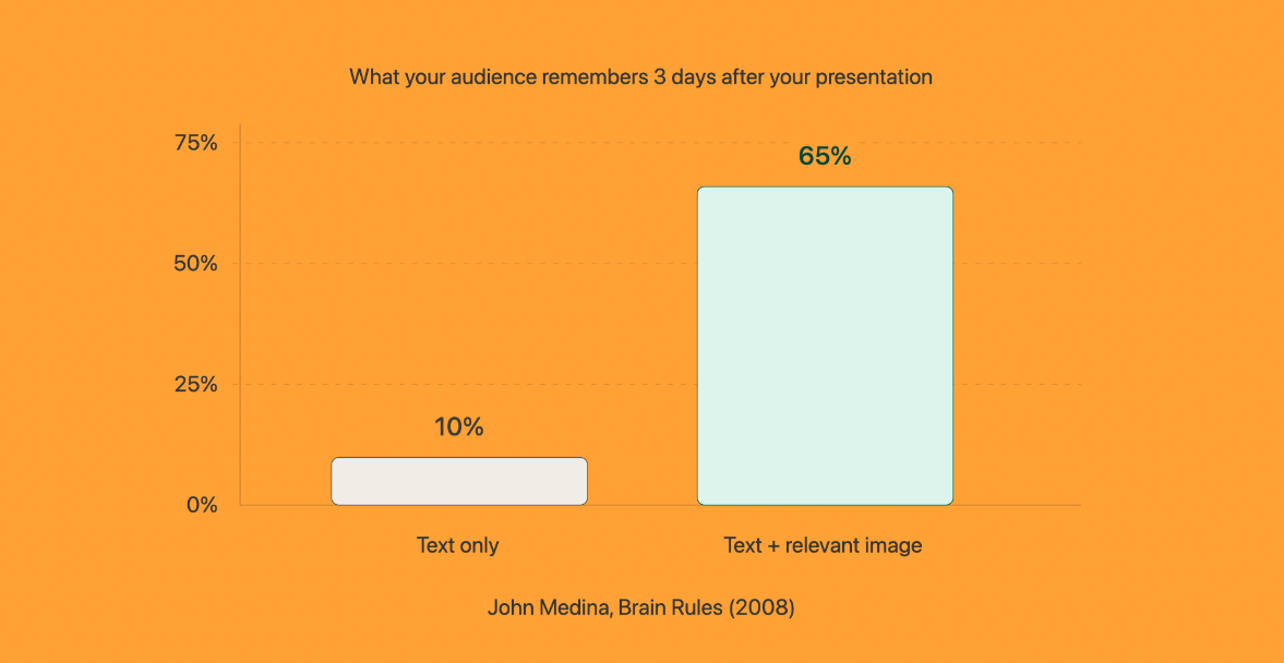
The important word is relevant. A generic stock photo of two people shaking hands in front of a laptop won’t make the cut.
If it adds nothing to the audience’s understanding, it may be competing with information that matters more.
A relevant image could be:
- A chart that makes the data visible
- A diagram showing how a process connects
- A product image demonstrating a feature
- A timeline clarifying sequence
- A before-and-after comparison
- A visual metaphor that makes an abstract idea concrete
The image should help the point land. It should not simply fill an empty corner.
Dense slides divide attention
In one eye-tracking study, participants were shown slides with different layouts. When a slide contained a single clear point, people read every word and attention remained focused.
As more content was added, attention dropped.
When a dense block of text appeared beside a complex diagram, engagement with the diagram collapsed. The visual evidence was there, but almost none of it was absorbed.
This is a common presentation mistake. A presenter creates one enormous process diagram, adds an explanatory paragraph and assumes the audience will work through both while listening.
They will not.
Instead, start with the main point and then break the visual into smaller, digestible sections across several slides. You can still provide the complete diagram afterwards as supporting material.
The live presentation should help people understand it one stage at a time.
Reading and listening compete for the same channel
When an audience reads text from a slide while the presenter speaks, the brain has to process two verbal streams at once. One will lose.
You have probably experienced this yourself. A text-heavy slide appears, you start reading it, and the presenter continues talking.
A few seconds later, you realise you have missed what they said. That is not bad manners; it is how working memory operates.
Less text is the answer.
A useful rule is:
If you are going to say it aloud, it does not need to appear on the slide.
That is what speaker notes are for.
The average adult reads at around 200 words per minute, while presenters often speak at between 100 and 150 words per minute. If the audience can read the slide faster than you can say it, your delivery becomes an audio delay on information they have already processed.
It is like hearing the same song through both headphones, except one side is slightly behind. Not helpful.
If the slide says everything, you do not need a presenter
If your slides contain every detail the audience needs, you’ve created a document instead of a presentation
You may as well export it as a PDF and send it by email.
Slides and speakers should perform different jobs. The presenter explains the argument, while the slide shows the evidence.
The presenter provides context, stories, interpretation and emphasis, while the slide provides a clear point, an image, a number or a diagram that supports what is being said.
You should not read a slide aloud. If you need to read it, it probably belongs in a report.
People scan slides just as they scan websites
People do not usually read every line on a screen. They scan.
Eye-tracking research repeatedly shows attention landing on headings while body copy is skipped. The pattern can resemble a layer cake: a stripe of attention on a heading, a blank area where the paragraph sits, then another stripe on the next heading.
People look for patterns and avoid anything that resembles noise. On many slides, the body copy is the noise.
That makes the headline the most important element on the page.
Labels name topics. Arguments communicate ideas
Many presentation headings are labels:
- Market overview
- Our approach
- Project update
- Customer challenges
- Next steps
These tell the audience what the slide is about. They do not tell them what they need to know.
An argument headline communicates the point:
- Demand is growing fastest in mid-market accounts
- Our current process adds three weeks to delivery
- Customers leave when onboarding takes more than ten days
- The new model reduces reporting time by 40%
- We need approval by Friday to meet the launch date
For the people who read only the heading, a label teaches them nothing. An argument gives them the entire thought.
Writing one does not need to be complicated. Imagine you met a colleague in the corridor and had ten seconds to explain the slide.
What would you say? That sentence is probably your headline.
Run the headline-only test
When your deck is finished, remove all the body copy, bullets and supporting text. Then read the headlines in order.
Do they form a complete argument from beginning to end? Could somebody understand the story of the presentation without seeing anything else?
If the answer is yes, you have built a coherent deck. The images and body content are supporting evidence.
The argument should stand on its own.
This test also reveals weak slides. If you cannot write a clear argument headline, the slide may not have a point yet.
You can improve it or delete it. Both are better than keeping a slide simply because you already spent time building it.
Move the detail into speaker notes
When in doubt, take the paragraph, bullet list or detailed explanation off the slide and move it into the speaker notes.
Speaker notes are not just a safety net for presenters who forget their lines.
Use them to store:
- Context
- Examples
- Supporting evidence
- Stories
- Transitions
- Definitions
- Objection handling
- Important statistics
- Reminders about pacing
A clean slide means the depth is being delivered by the presenter rather than dumped onto the screen.
With well-written notes, there is rarely a reason to place a paragraph on a slide again.
Put the important message first and last
Memory follows a well-established pattern. People tend to remember what comes first and what comes last.
The middle is where information goes to be forgotten.
This is closely related to the primacy and recency effects and, in experience design, the peak-end rule.
Now consider how most decks are structured. They begin with housekeeping, then comes an agenda, then some background.
The most important information sits somewhere between slides four and fourteen, and the presentation may or may not finish with a clear conclusion.
Whatever you most need the audience to remember, say it first. Build the evidence in the middle, then return to the point at the end using different words.
Do not waste the opening on housekeeping
The first moments of a presentation are your most valuable memory real estate. Do not spend them on a lengthy agenda, introductions everyone already knows or administrative details.
Set the scene. State the problem. Reveal the conclusion.
Give the audience a reason to care.
You can explain what you will cover aloud if necessary, but an agenda rarely needs its own slide. A presentation is not a document, so it does not need a contents page.
End on the point you want remembered
The final thing you say is also likely to remain in short-term memory. Do not end with “Any questions?”, a contact-details slide or a vague summary.
Finish with the message that matters most.
Open with the point, build the case and close with the point again. Your final slide should help the audience retain the conclusion.
Two ideas on one slide is not more efficient
Adding two or three points to one slide can feel efficient because you are reducing the slide count. But you are also splitting attention, increasing cognitive load and asking the audience to decide where to look.
More slides are not necessarily a problem.
A presentation can contain many slides as long as each one is simple, clear and purposeful. One idea per slide often produces a longer deck that feels faster.
The audience processes each point quickly and moves on. The goal is not to minimise the number of slides; it is to minimise confusion.
Sparse slides are harder to build
There is a hidden anxiety behind many overcrowded presentations. A sparse slide can look as though you did not do enough.
One headline and one image may feel thin, lazy or underdeveloped.
The research suggests the opposite. A sparse slide is harder to create than a dense one.
Writing one sentence that captures the whole point requires you to understand exactly what that point is. A bullet list lets you avoid the decision.
Density is easy. Clarity is hard.
The simplest-looking slides are often the result of the most thinking. The presenter has decided what the slide is for, what the audience needs to understand, which evidence supports the argument and what can be removed.
Minimalism is not the absence of effort. It is evidence of editing.
Your slides are not the presentation
Your deck can support your argument, focus attention, make data visible and help the audience remember. But it cannot replace you.
The presenter is responsible for the context, energy, interpretation and human connection.
The slides are not the presentation. You are.
The exceptional presentation checklist
Before delivering your next deck, ask:
- Does each slide communicate one clear idea?
- Can I summarise the slide in one sentence?
- Is the headline an argument rather than a label?
- Does the visual directly support the point?
- Have I removed anything I plan to say aloud?
- Can the audience process the slide within a few seconds?
- Does the sequence of headlines tell a complete story?
- Is the most important message stated at the beginning?
- Is it reinforced at the end?
- Have I moved the supporting detail into speaker notes?
- Could any overloaded slide be broken into smaller parts?
- Does every slide have a clear purpose?
The next time you open a blank deck, resist the urge to begin with bullet points. Start with the argument, decide what the audience needs to remember and build the presentation around the way their brain actually works.

Is your marketing making its point clearly?
Great presentations and great marketing have something in common: they make complex ideas easy to understand, remember and act on.
Book a free 30-minute Marketing Strategy Session with Articulate founder Matthew Stibbe. We’ll review your positioning, website and marketing to identify what is working, what is creating friction and where clearer thinking could deliver better results.





.jpg?width=400&height=250&name=Frame%201584%20(1).jpg)