Posted by
Aoife Porter
Posted by
Aoife Porter
Data and analytics are at the core of making intelligent marketing decisions. 42 percent of marketers agree that they have the right tools to collect and analyse data but don’t know how to use them.
When used efficiently, marketing dashboards make it quick and easy to analyse your marketing efforts. They allow you to visualise your key performance indicators (KPIs), measure your performance and set goals. And, they make you look good in front of your boss when you present them at team meetings. But, like everything, if used incorrectly they can cause more trouble than good.
Here are six common pitfalls of marketing dashboards and how you can run, jump, and leap over them gracefully:
1. Overcrowding
Pitfall: You may be using dashboards for the first time or be an expert already. Either way, sometimes there’s just. Too. Much. Data! Overcrowded dashboards will overwhelm you and your team. Some things don’t need their own graph or table. If they provide no value, don’t waste the space.
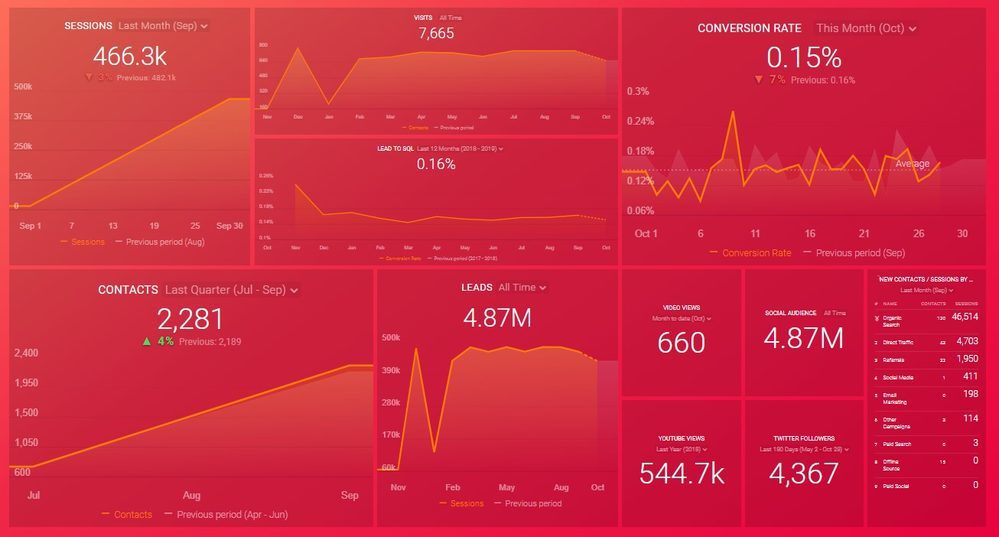
How to overcome: Start from scratch. Sit down with your team and look at what KPIs are most important for reporting. Stick to those essential metrics. You can create different dashboards for different parts of your campaign if that makes it easier. When you think more information is needed, try linking out of the main dashboard, that way, anyone that wants to delve deeper can access other reports themselves.
2. Too much detail
Pitfall: You may think the more complex the metrics, the better. But, let’s get real – who are you trying to impress? When reporting to other teams, you want everything to be as clear as possible so everyone can actually use the information they’re given. Your dashboard should trigger the right questions and actions.
How to overcome: Make sure that the information is understandable at a glance. This means when you’re looking for something in a rush, you will be able to find it. In meetings, everyone can figure out what you’re referring to with a quick scan. Simplify your dashboards by using the most suitable visual representation for showing the data clearly.

3. Using the wrong visuals
Pitfall: Using a pie chart instead of a bar chart because it looks prettier or adds variety is often tempting. But, don’t give in! Doing this means you don’t present the data properly and it makes it harder for yourself and others to understand.
How to overcome: When choosing your visuals, make sure everything is clear and concise. Ask yourself these three questions.
- What am I trying to show?
- Why am I trying to show it?
- Will this ‘X’ chart or table display these points clearly?
Variety is not the answer to a useful dashboard; clear, understandable data is. If you’re not sure, get a second opinion and ask someone else on your team to walk you through the information on your chart. If they can’t figure it out, you may have a problem.
4. Having unclear goals (or none at all)
Pitfall: There’s no point in reporting on random statistics with no clear goal in mind. Unfortunately, if you’re finding it tricky to figure out goals, you might throw in the towel early. If that’s the case, you’ll end up putting any old thing onto your marketing dashboard in the hope that some sort of coherent picture will emerge.
How to overcome: Use SMART goals (specific, measurable, attainable, relevant and timely) or OKRs (objectives and key results). In a study by Domincan University, they found that 76 percent of users that had written goals and reported on them weekly, achieved them. Ensure that your dashboard metrics are in line with your goals. For example: ‘Generate 20 leads from social media in the next 30 days.’ is a great goal for a marketing team.
To help visualise this goal you might present something like, ‘leads obtained from various social networks week by week’. This way you can see if you’re on your way to achieving this goal or if changes need to be made.

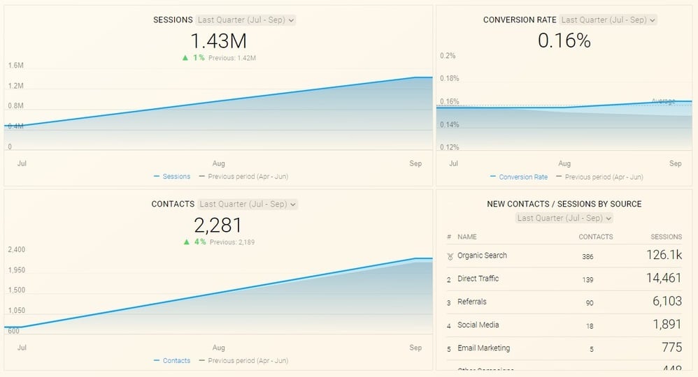
5. No context
Pitfall: Many dashboards fail because the metrics used have no context. If you only display the number of generated leads for this month on a dashboard, you will gain no insights into where you or your team stand. Is a hundred leads good or bad? Were you expecting a thousand?
How to overcome: To be able to gain better visibility and stay in line with your goals, you will need past data and future predictions. These will help you stay on track and continue to improve your marketing campaigns and strategies. You can use software like HubSpot to set goals and display your current data against the previous month or year.
6. Correlation is not causation
Pitfall: How many times have you seen statistics that have nothing to do with one another displayed on the same graph? This happens when managers are trying to compare data or link a certain campaign to results, or just by accident. Interpreting data the wrong way can be damaging to your team’s efforts and make it look like you have no idea what you’re talking about.
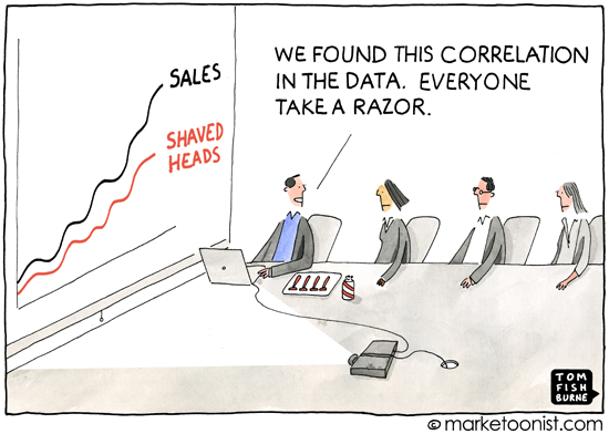
How to overcome: Look at your numbers in more detail. Don’t assume causation immediately. Perform experiments, like A/B testing and see what factors affect your results. Keep an eye on these metrics and don’t confuse a coincidence with a definite reason for a certain outcome.
e.g. Change your ad messaging on half of your Facebook ads (Test) and leave the other half as is (Control). Let’s say, you notice an increase in engagement or traffic from the ads you have changed. This shows proof of genuine correlation and causation because - as long as nothing else has changed - you’re seeing a positive result for your test and no change in your control.
Most of these problems are easy to overcome. And, with a clear view of what lies in store, you can add a strong analytical tool to your teams’ reporting weapons.
Marketing dashboards are the Ross to your Rachel. Even if you were ‘on a break’ for a little while, really, you belong together. And, with these best practices in your back pocket, you can enjoy a bumpy-but-beautiful, data-driven journey.
Want to learn about more nifty tools that can help you with your data? Here are five SEO weapons to get your reporting ready.